Operator — A Monospace Typeface by Hoefler & Co.
Today, the folks at Hoefler & Co. unveiled a new typeface called Operator, which is rooted in the traditions of typewriting but designed for modern designers and developers. In this blog post, Jonathan Hoefler gives some fascinating insight into how Operator was designed:
What if, in addition to shedding the unwanted baggage of the typewriter, we also looked to the programming environment as a place where type could make a difference? Like many screen fonts before it, Operator could pay extra attention to the brackets and braces and punctuation marks more critical in code than in text. But if Operator took the unusual step of looking not only to serifs and sans serifs, but to script typefaces for inspiration, it could do a lot more.
They also produced a four-minute film about Operator and type design in general, which can be viewed in that same blog post. (I would embed it here, but the Vimeo privacy settings on it won’t allow me to.)
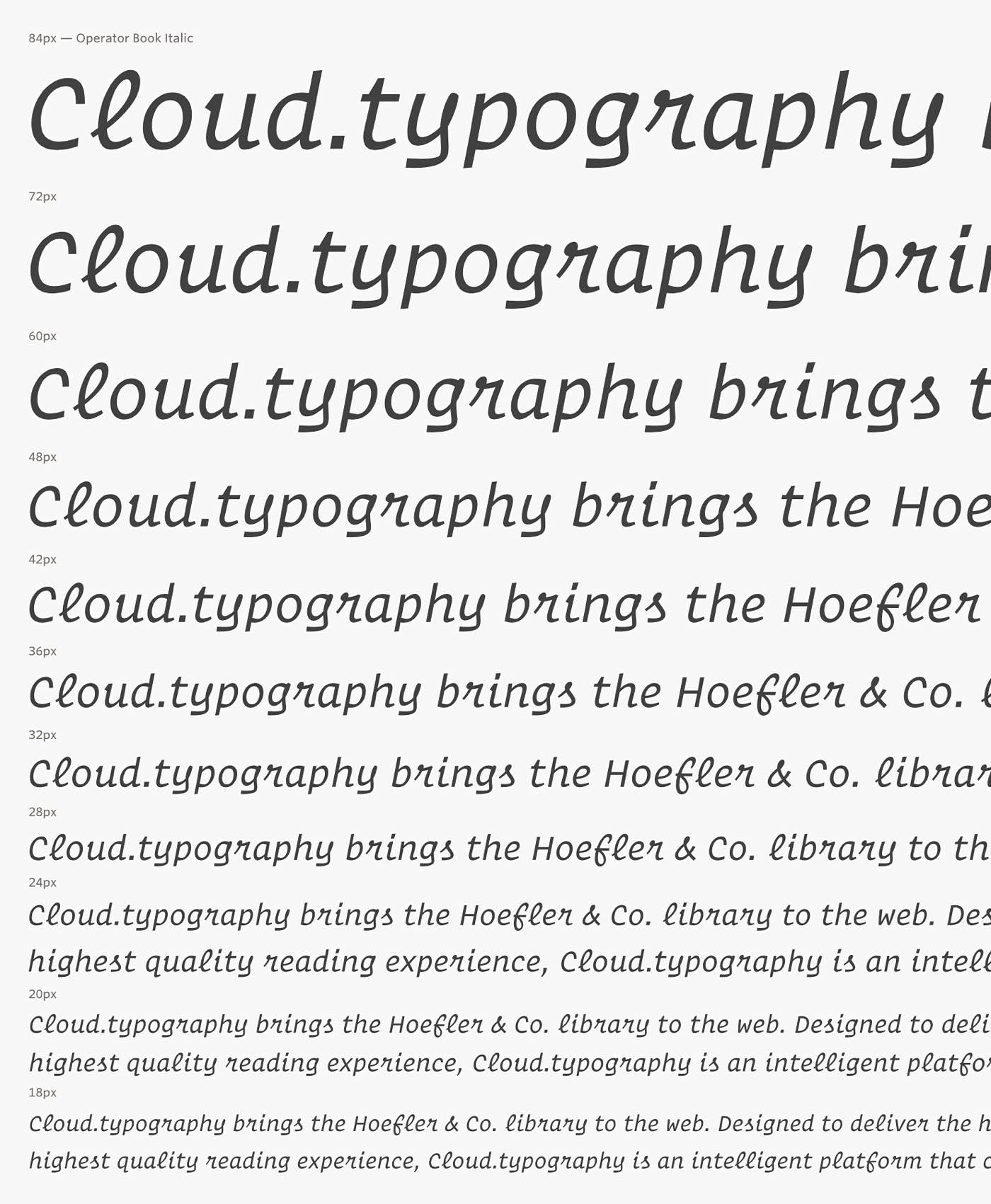
The complete Operator family includes 64 styles grouped into nine natural-width weights — including Light, Book, Medium, Bold, and Black — plus 10 monospace styles (aka Operator Mono). I’m a fan of the Book Italic style, especially those lowercase r‘s:
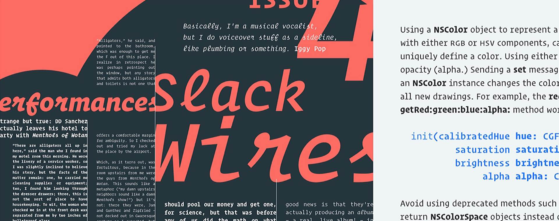
They offer a bunch of different packages — for either web use or any number of computers you need — starting from $199 at Hoefler & Co. If you’re a Cloud.typography subscriber, you should already be able to access several Operator styles (for web use only, obviously) at no extra charge.