Welcome to this week’s edition of our Friday Quality Linkage column. Please enjoy this week’s collection of interesting and entertaining links. Brew a fresh cup of coffee, find a comfortable place, and relax.
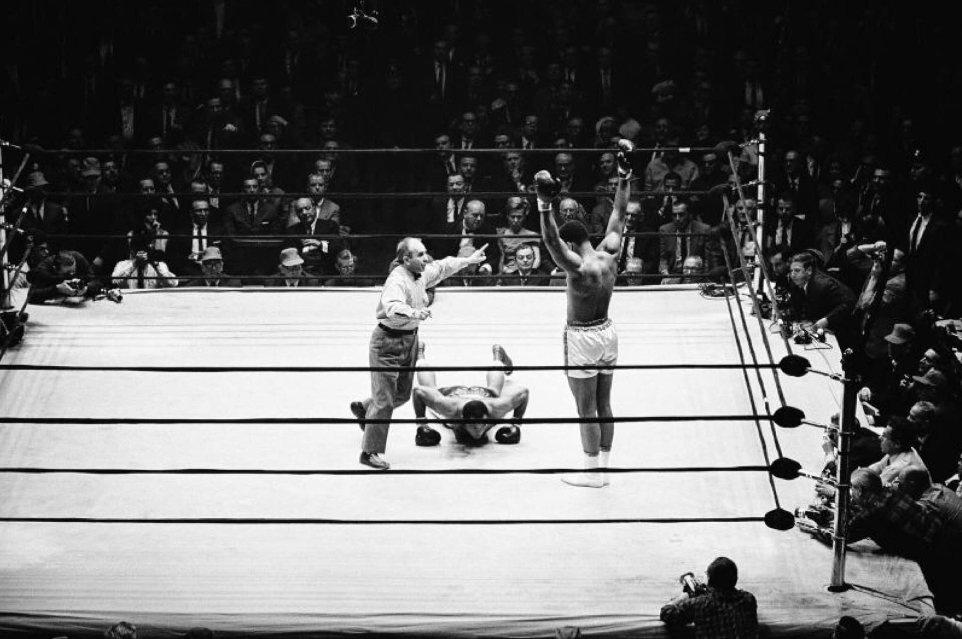
Photo: AP
Muhammad Ali Was the Meanest Boxer of All Time »
Hamilton Nolan, Deadspin:
You would never teach anyone to fight like Muhammad Ali. That would be crazy. […] Muhammad Ali was called the greatest not because he won, but because he won in a way that no mortal man could reproduce. Many young up-and-comers give it a try, and after catching a varying number of punches to the face decide that perhaps the Ali style is not for them after all.
[…] The apparent flaws of very, very great fighters are really just private dance moves on top of a ladder of boxing skill that has run out of rungs.
Rest in peace, Ali.
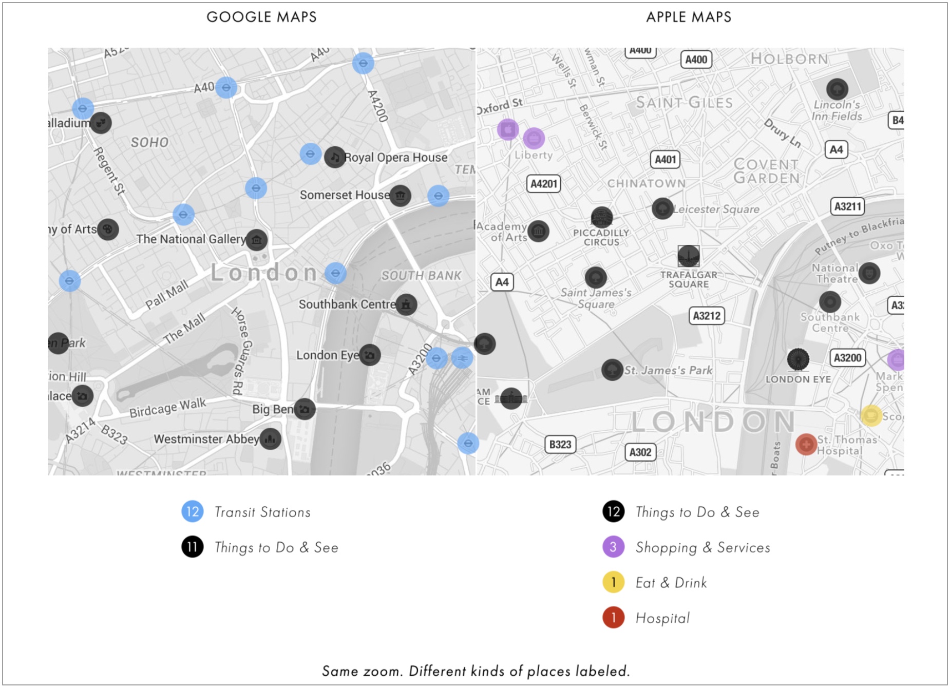
Graphic: Justin O’Beirne
Cartography Comparison: Google Maps & Apple Maps »
Cartographer (and Apple’s former Head of Cartography) Justin O’Beirne recently published the first in a series of extensive (and I do stress that word) reviews comparing and contrasting the cartographic differences between Apple Maps and Google Maps:
Google Maps and Apple Maps.
Both are the default mapping apps on their respective operating systems (Android and iOS).
And both are in a race to become the world’s first Universal Map — that is, the first map used by a majority of the global population. In many ways, this makes Google Maps & Apple Maps two of the most important maps ever made.
Who will get there first?
And will design be a factor?
In this series of essays, we’ll compare and contrast the cartographic designs of Google Maps and Apple Maps. We’ll take a look at what’s on each map and how each map is styled, and we’ll also try to uncover the biggest differences between the two.
As he goes on to show, these maps aren’t just about showing you how to get places; they’re insights into how two giant companies choose to present the world around us.
Brew some coffee and settle in, this is a long (but great!) read.
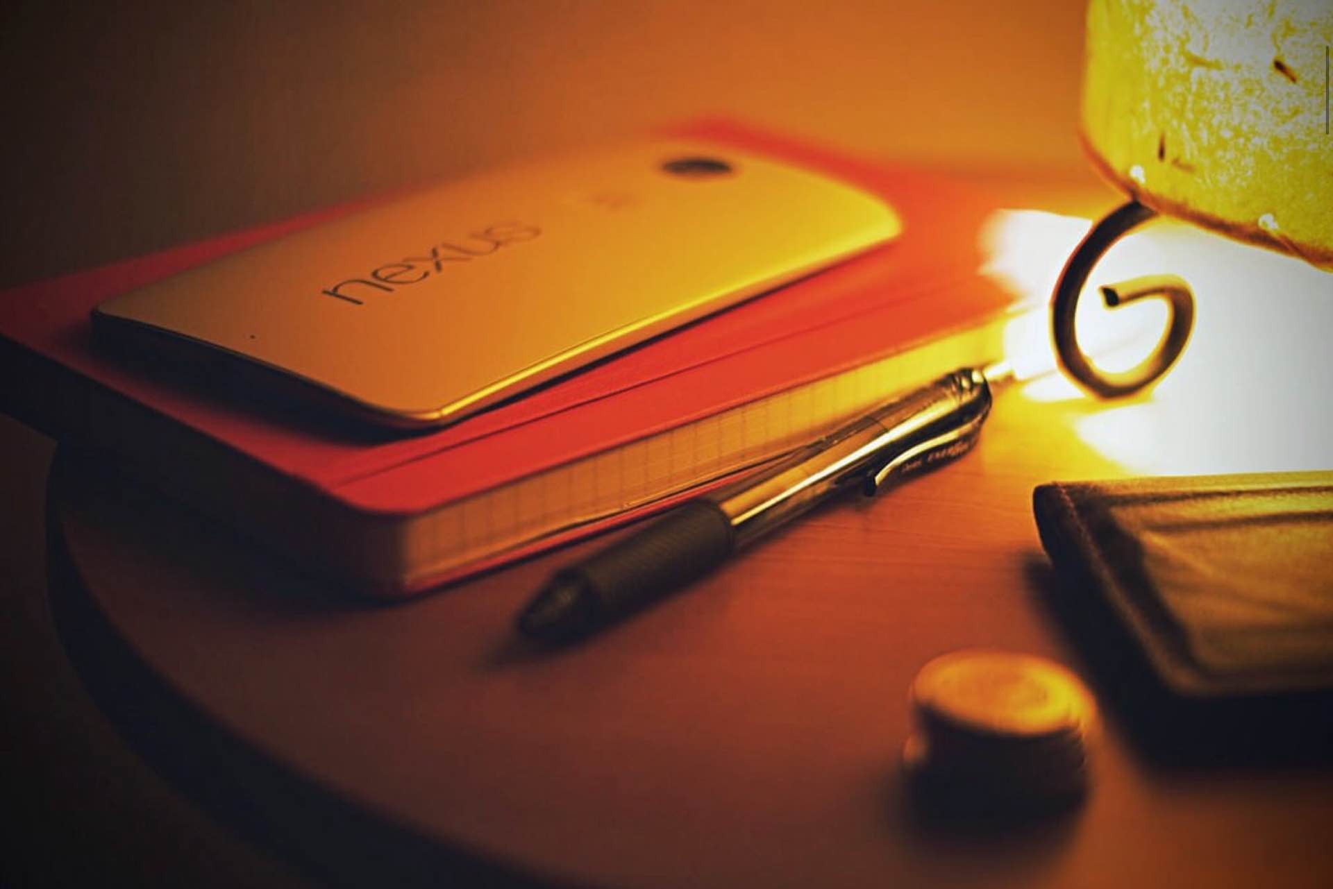
Photo: Trako Antonio
Why You Should Always Carry a Notebook »
Srinivas Rao, host of the Unmistakable Creative podcast, wrote about the importance of always being able to jot down ideas as soon as they come. It really all comes down to this:
If you haven’t noticed, ideas don’t always show up according to our schedule. The muse is a fickle mistress who makes appearances at her own convenience. […] If you’re going to consistently come up with ideas to write about or do something with, you have to be able to capture them regardless of when they show up.
If you’re not going to carry a physical notebook, you should use Drafts for iOS. For me, it’s where I can quickly jot down thoughts/inspirations that I can find a more permanent place for later.
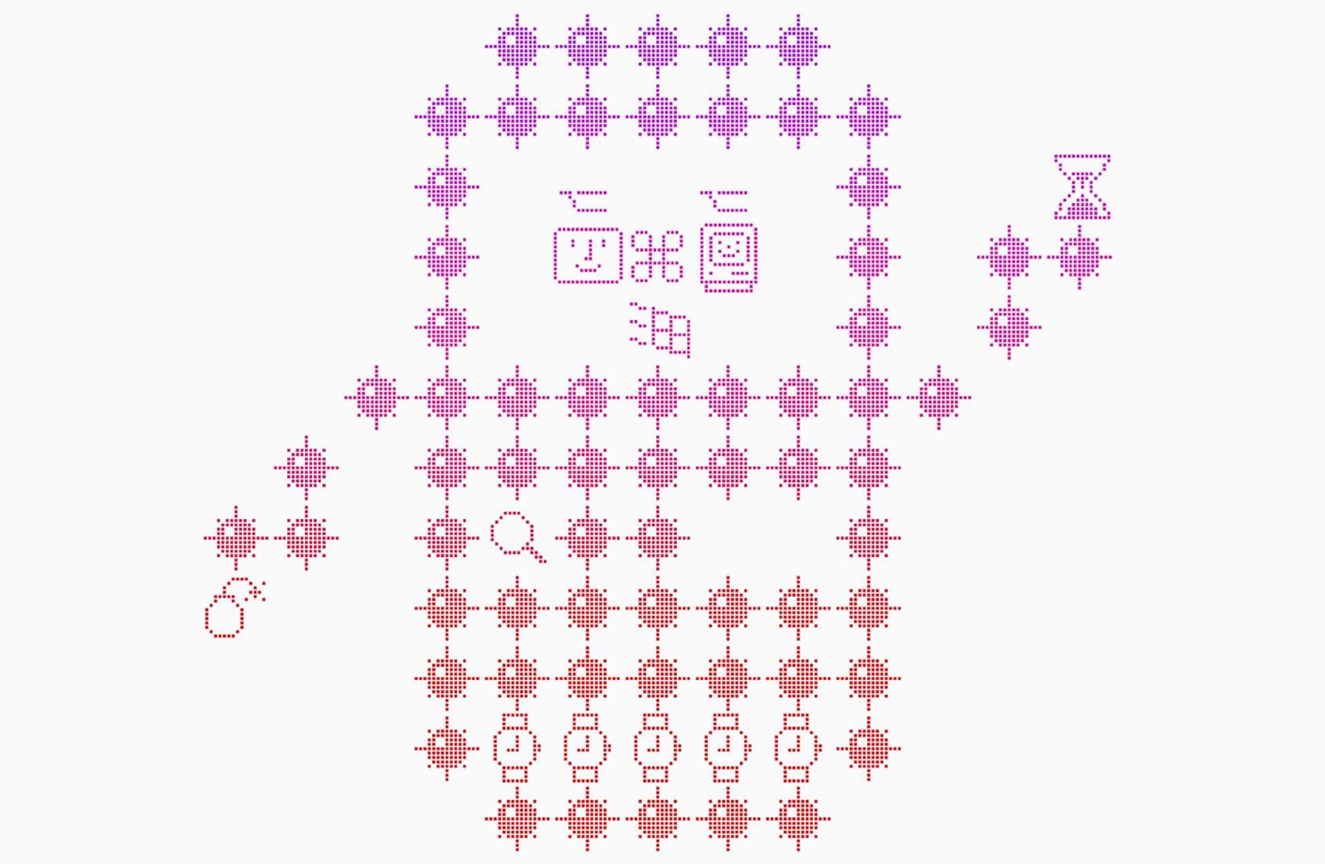
Illustration: iA
On Icons »
The folks at iA — makers of iA Writer for Mac and iOS — took a good long look at the use of icons in modern UI design and what it all means:
Text now communicates clearly. However, it feels less humane, less fun. It feels more like work, it feels cold, and, surprisingly, it feels more complicated. How is that possible? Labels alone are rationally less complicated when you use them, but they feel more complicated by their mere aesthetics.
Labels are the rational choice. Rationally structured and labeled functions are the heart of human-computer interaction.
Icons alone are the emotional choice. Well-designed icons have a positive emotional impact. Emotional design quality is not measurable, but this doesn’t make it less real.
What’s Life Like for David Letterman After The Late Show? »
Tom Brokaw spoke with David Letterman about his life of quiet retirement after decades spent in front of a camera. Great little conversation.
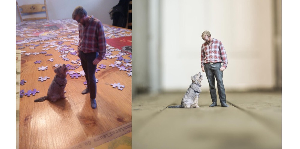
Photos: Ryan North
Making a “3D Photo” Statue of Yourself »
Ryan North — who runs the Project Wonderful ad network and creates those dinosaur comics you see around the internet sometimes — shows how he had a “3-D picture” taken of himself and his dog Chompsky, which was used to create miniature statues of them as a funny-but-awesome gift to Ryan’s wife:
First, computers take the over one hundred different images of me and Chompsky, all taken in the same instant, and use that to build a 3D mesh of our bodies. This is the rough mesh, but it’s not fully automated: human artists touch them up, not only cleaning up any mistakes the algorithm made, but also making adjustments if necessary. For example, individual fingers can break off easily when they’re printed small, so they might bring fingers together instead of having them spread apart. If I was holding a leash, they’d remove that too: it’d break, and it’d be more fun to put in a piece of string in the final model instead. Glasses can also be tricky and might need human intervention.
Once the 3D data is done, the mesh gets a “skin” applied (i.e., MY OWN), and then robots assemble me and my dog from parts.
Specifically, tiny parts of dust!
He added plenty of photos and videos documenting the process. Neat stuff!
Got any suggestions for articles, videos, stories, photographs, and any other links you think we should be posting in our weekly Quality Linkage? Please do let us know on Twitter.