Apple's newest iPhones are a story of tradeoffs for the first time in their history. Gone are the days of true corner-to-corner one handed use. Say goodbye to not noticing your iPhone in your front pocket, or even carrying your iPhone in your front pocket.
But also gone are the days of worrying about battery life. Gone are the days of cramped keyboards and funny autocorrect quips.
The iPhone 6 Plus isn't an iterative iPhone by any stretch. It's a brand new phone with a brand new toolbox and a brand new personality. Some people may call it a "phablet", while I find it to be just a rather large phone. Some think they can replace their iPad/iPhone duo with just the 6 Plus, while I have found new uses for my iPad and still can't see myself without one.
Quite clearly, the iPhone 6 Plus has a polarizing personality. You're either going to really love it, or you'll realize fairly quickly that it just won't work for you.
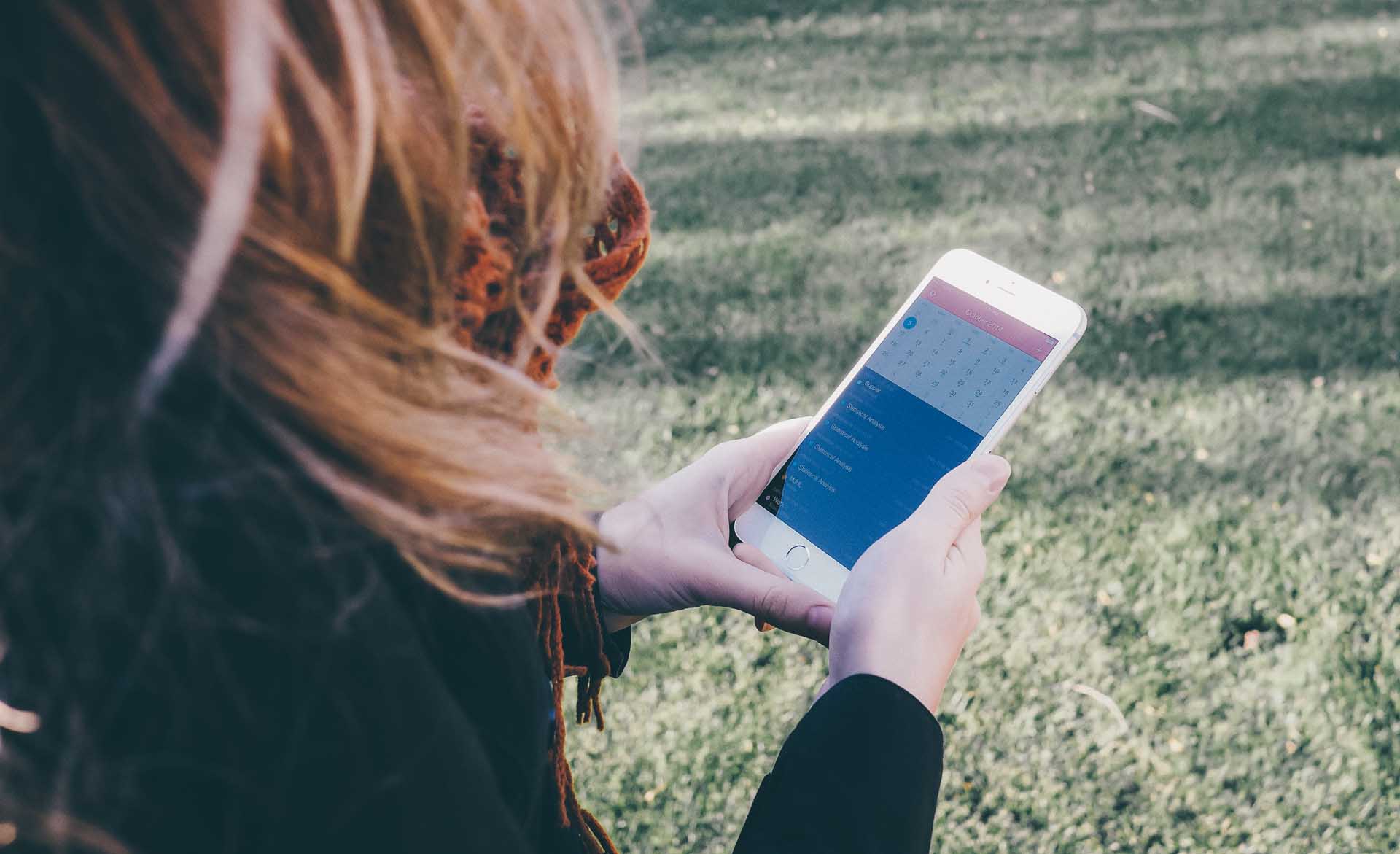
Using Fantastical on the iPhone 6 plus
Choosing a color can be very much equated to the unwritten jersey color rule in hockey: If you're a small, fast team, you choose to wear black jerseys to make yourself look bigger and bolder. If you're a large, slow team, you choose to wear white jerseys because you can be perceived as a faster team. This is why I feel the smaller and sleeker iPhone 6 looks more stylish in Space Grey, while the larger 6 Plus looks more elegant in white. Fortunately, I'm happy with both the white facade and the silver backdrop.
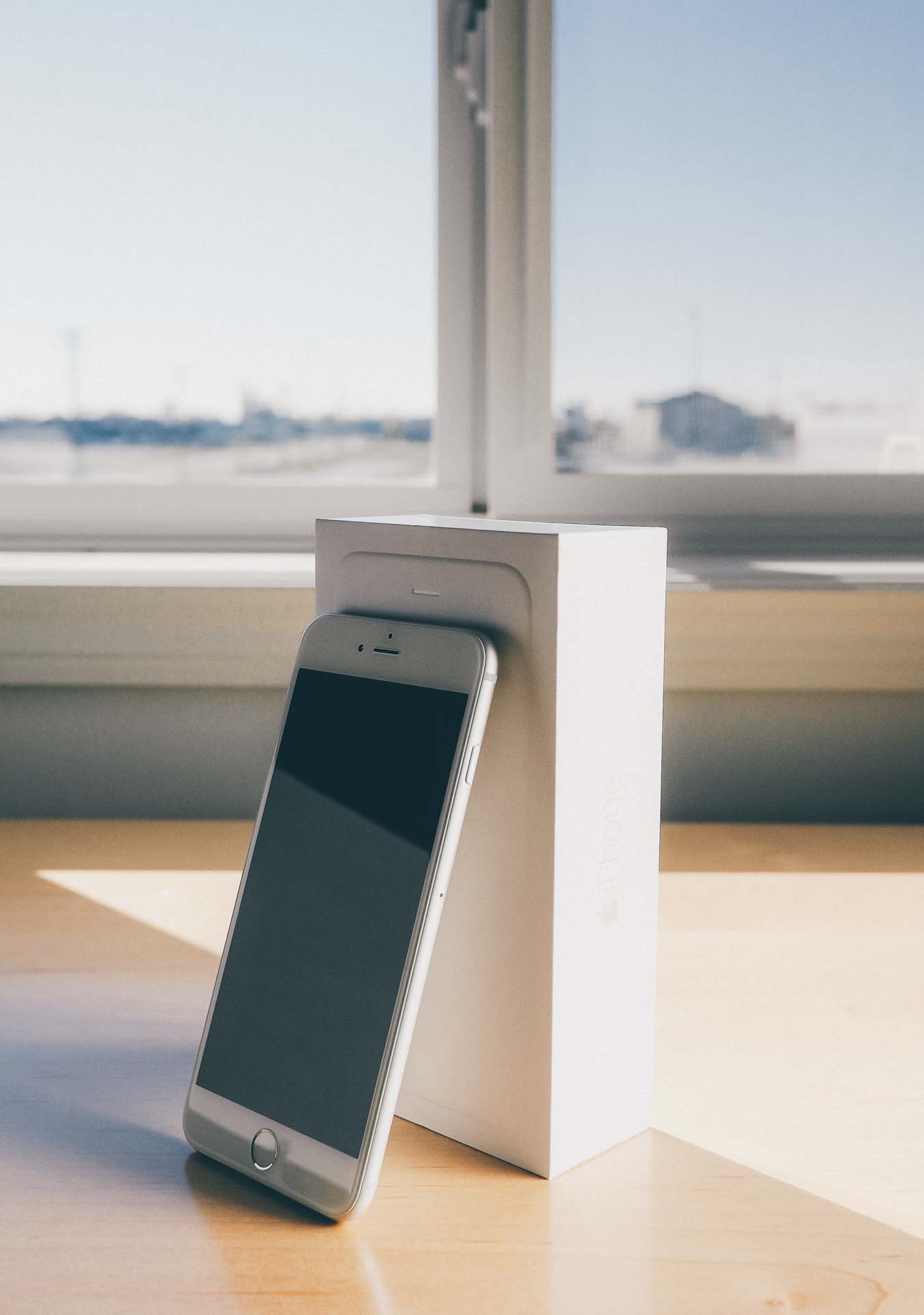
The iPhone 6 Plus also comes in an abnormally large box (compared to past iPhone boxes, that is).
The 6 Plus's size became immediately apparent; even the box loomed abnormally large on the shelf behind the counter at the local shop. Despite the box's blank exterior design, the sheer size of the box was enough to worry — and excite — me prior to purchase.
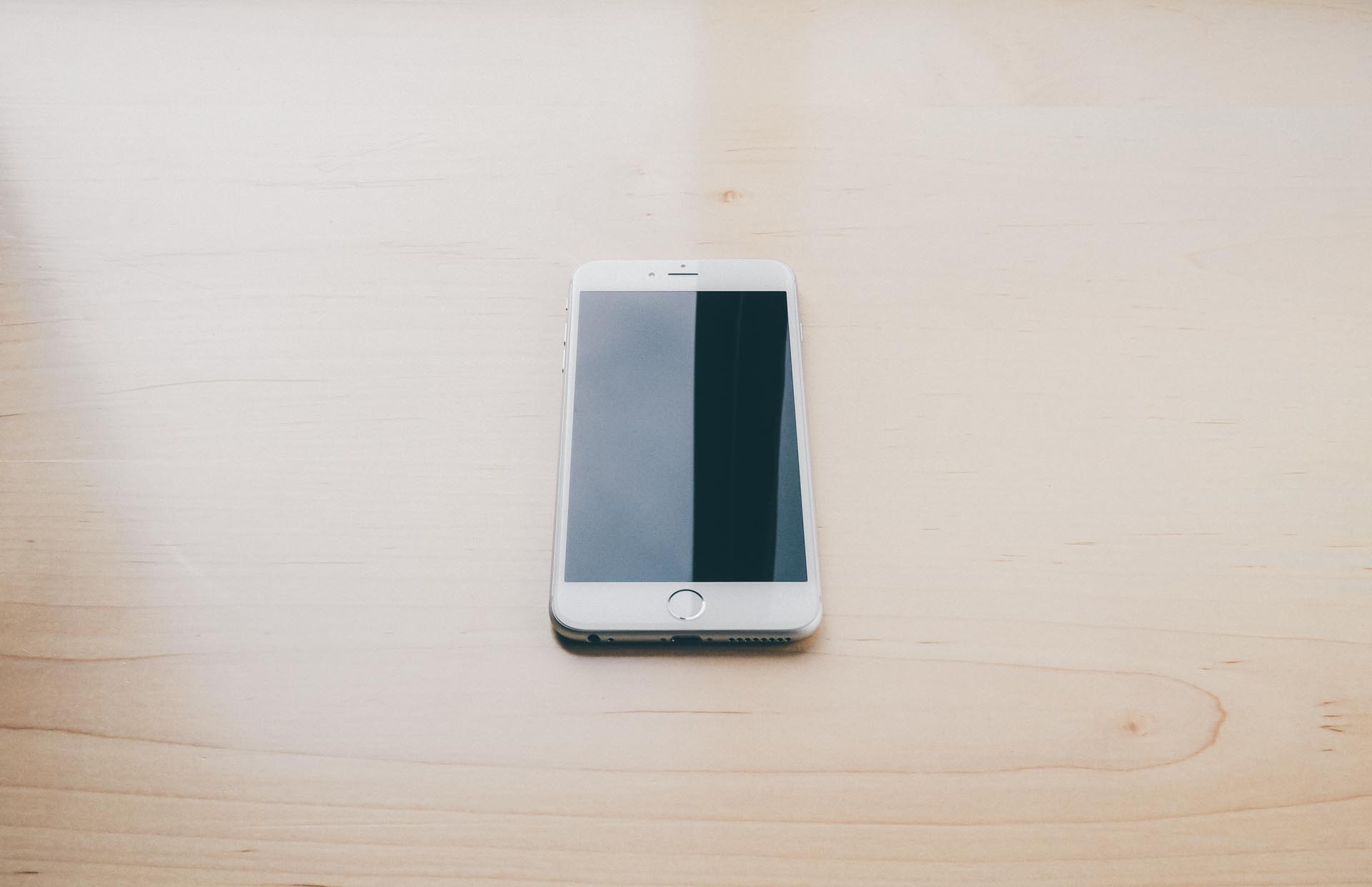
Whipping the phone out of the box confirmed my excitement.
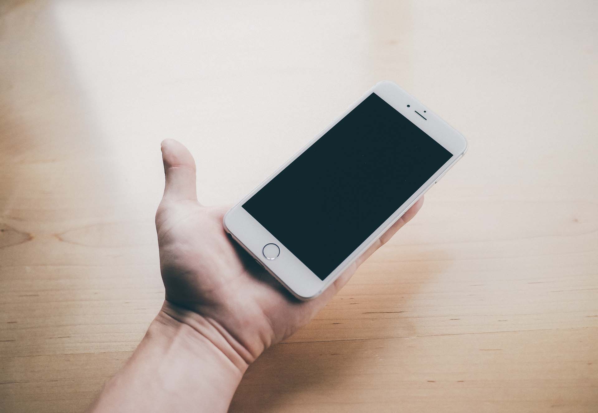
Aside from the significantly larger footprint, the front of the 6 Plus is the same old iPhone. Between the home button, ear speaker, front-facing FaceTime camera, and ambient light sensor, you could mistake the 6 Plus for other iPhone models. There are some variations to the classic iPhone design, but this is still the same old iPhone we love so dearly.
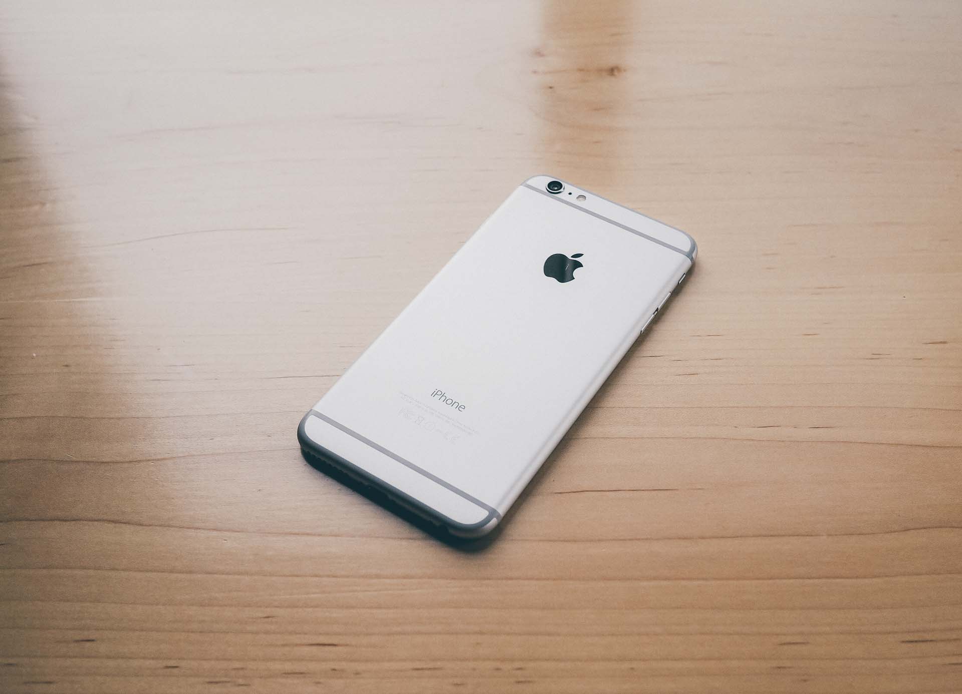
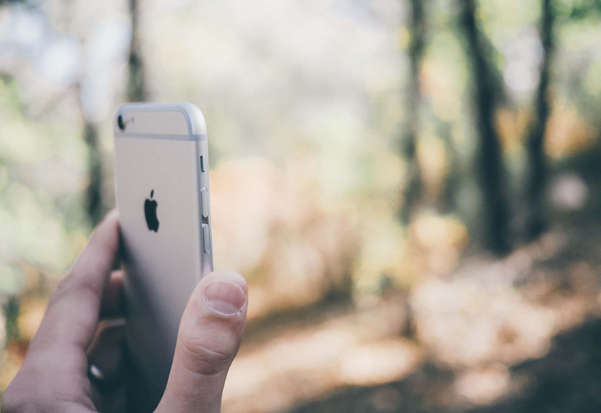
The back of the phone is adorned with two horizontal antenna lines that are reminiscent of the iPhone 5 and 5S. The lines are interesting design choices and I don't mind them, yet I can't help but be disappointed when comparing them to the iPhone 5 or 5S. While the iPhone 5 and 5S make the antenna compromise look awesome with a glass-to-aluminum combo, the iPhone 6 and 6 Plus have adopted a more clumsy, aluminum-only look. Score one for traditional design here.
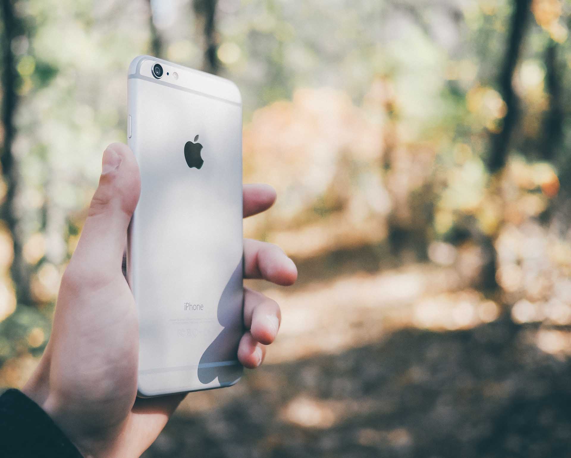
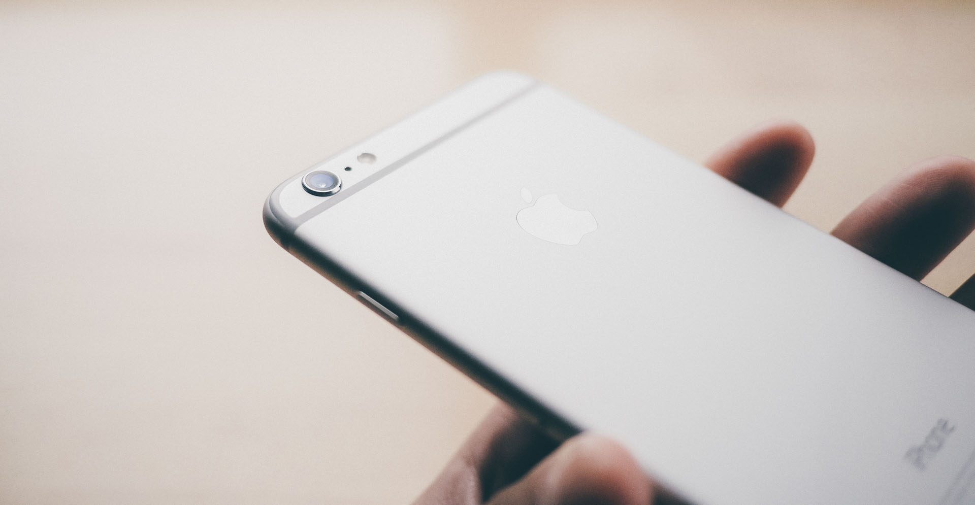
Apple's logo adorned on the back of the 6 Plus is always of interest. This time around, the Apple logo is made of stainless steel that glimmers brilliantly in the light.
Unfortunately, as you can see in the photo above, it can scratch quite easily. This scratch was acquired within the first two hours of use. Not a good start for the rest of the device's life.
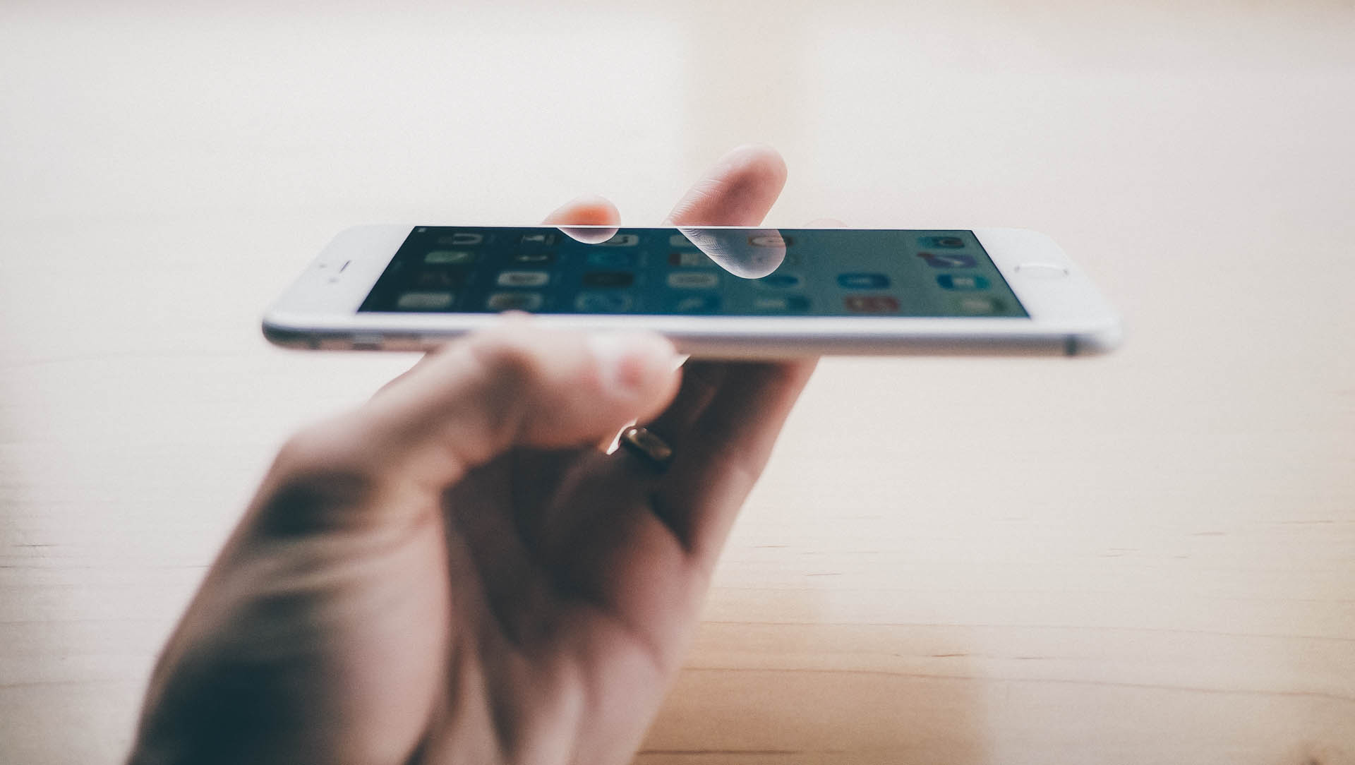
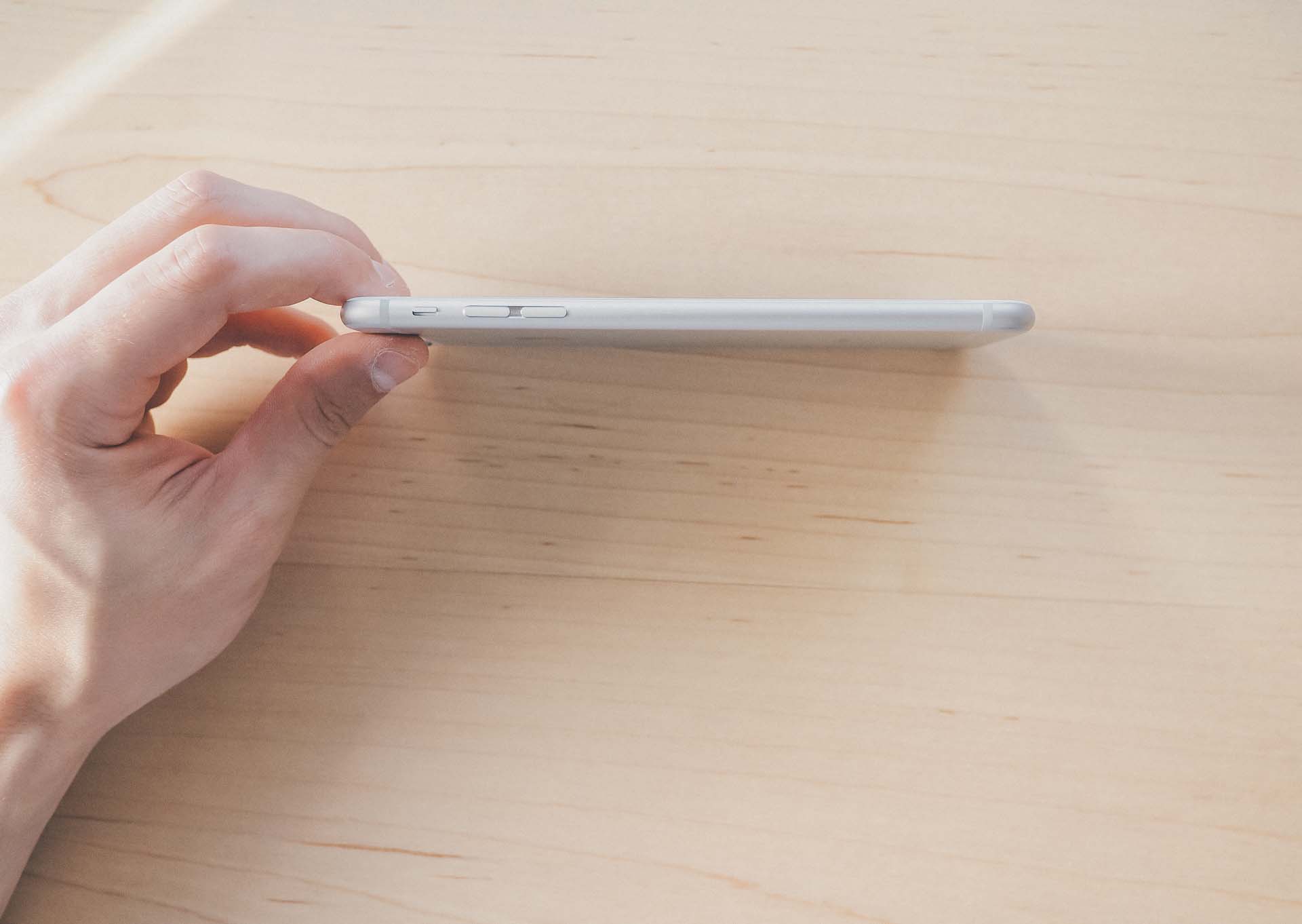
Somehow Apple has found a way to make both the iPhone 6 and 6 Plus thinner than any iPhone before them. I would trade a few extra millimeters for even better battery life, but there's no doubting how great this device feels in the hand.
The 6 Plus's size definitely demands two hands, yet I wouldn't say it is only a two handed device. Using the phone with one hand is a tad cumbersome, but I don't feel it's unmanageable.
The iPhone 6 Plus is my ideal desk phone. I spend the majority of my days working at a desk, which means I have more opportunities to use the phone with both hands. The nature of your life and work may urge you to purchase a one handed phone. If, like me, your phone acts as a text/email/telephone conduit at your desk, you'll be thankful to know that the 6 Plus excels as a desk phone.
Much has been said and written about the new design of the iPhone. Rounded glass meets rounded aluminum edges. The rounded edges feel fantastic in the hand, but they also eliminate the extra friction we've come to know in the iPhone 5 and 5S. These slippery edges will lead many to purchase a case — which, in turn, will make the phone that much bigger.
The other pitfall of purchasing a case will be in the loss of the buttery smooth left or right swipe from the edge of the screen. The rounded corners make that edge-swipe so much fun, but covering those rounded edges with a case will quickly eliminate the swiping experience.
And, of course, the case will make the 6 Plus that much bigger. Up to you. I'm going to go caseless for the time being and see where I end up.
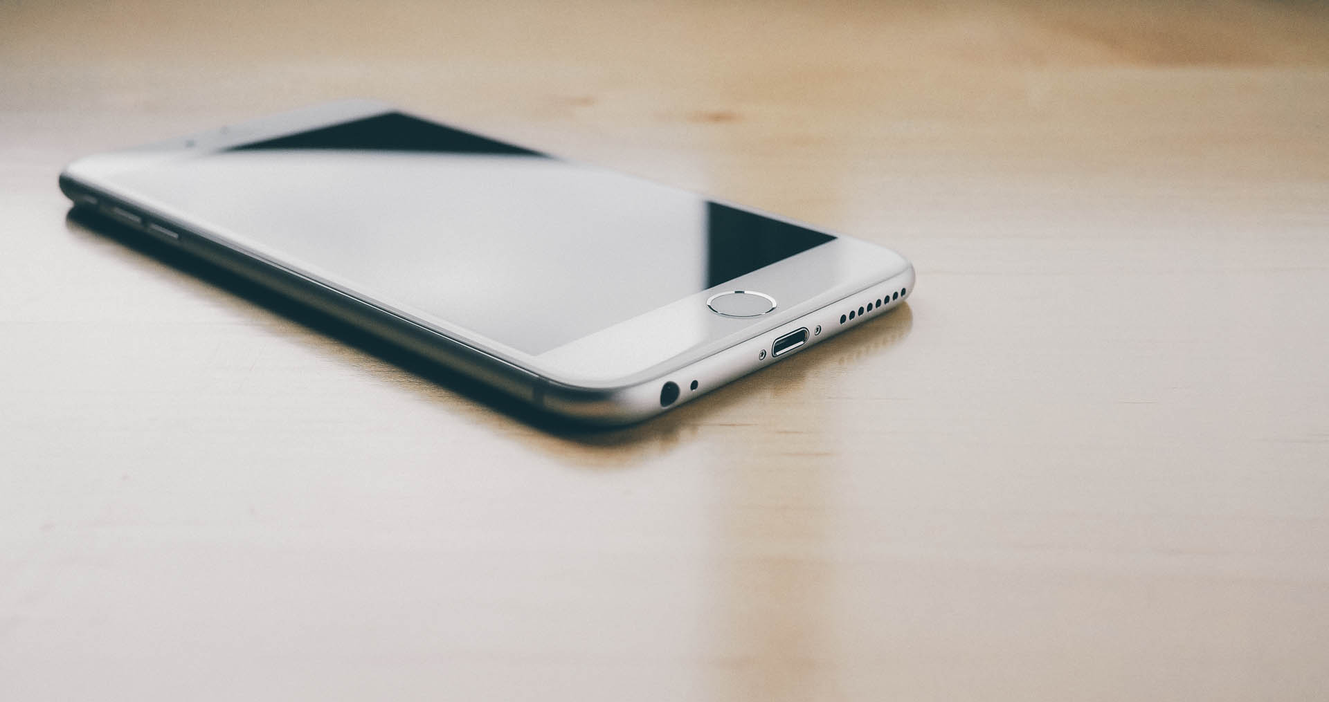
If you close your eyes and just feel the iPhone's edges, you'd be hard pressed to know where the glass ends and where the aluminum begins.
The rounded glass edges and lighter weight make the 6 Plus feel and look like shiny plastic. The seamlessness of the glass and aluminum only adds to this effect. Of course, once you pick up the device, you know it's not plastic.
With the glass-as-plastic analogy out of the way, I'll come out and say that Apple took a small step back in terms of visual aesthetic and a step forward in terms of ergonomics. This has to be a first for Apple — instead of making a device that urged its user to adapt and make compromises, Apple made design decisions to improve the feel of the large phone in your hand at the expense of some aesthetic beauty.
I admire this thought process. People wanted a larger iPhone, so they delivered a larger iPhone. In the process, Apple dealt with the shortcomings of large phones and designed their offering in such a way as to improve its ergonomic feel. This time, Apple made the compromise.
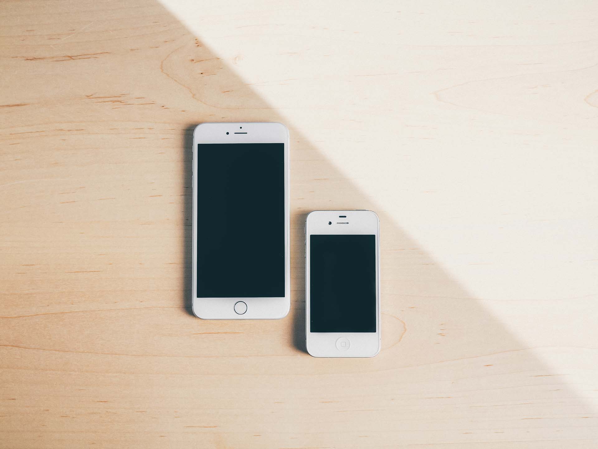
With a bigger body comes more space. Apple used the opportunity to plant bigger and better batteries in the extra real estate, pushing the iPhone 6 Plus's battery life well past the 24 hour time frame.
While my iPhone 5 would have to be recharged after the work day while sitting in a wifi network, the 6 Plus barely breaks the 75% threshold after the 8 hour trek. Switching over to LTE data definitely slams the battery harder, but I still have a hard time killing the battery between sun-up and sun-down.
So while some may argue the visual design of the iPhone 6 Plus has taken a step backwards, the ergonomic design and all day battery life make the device the best iPhone to use and hold all day long.
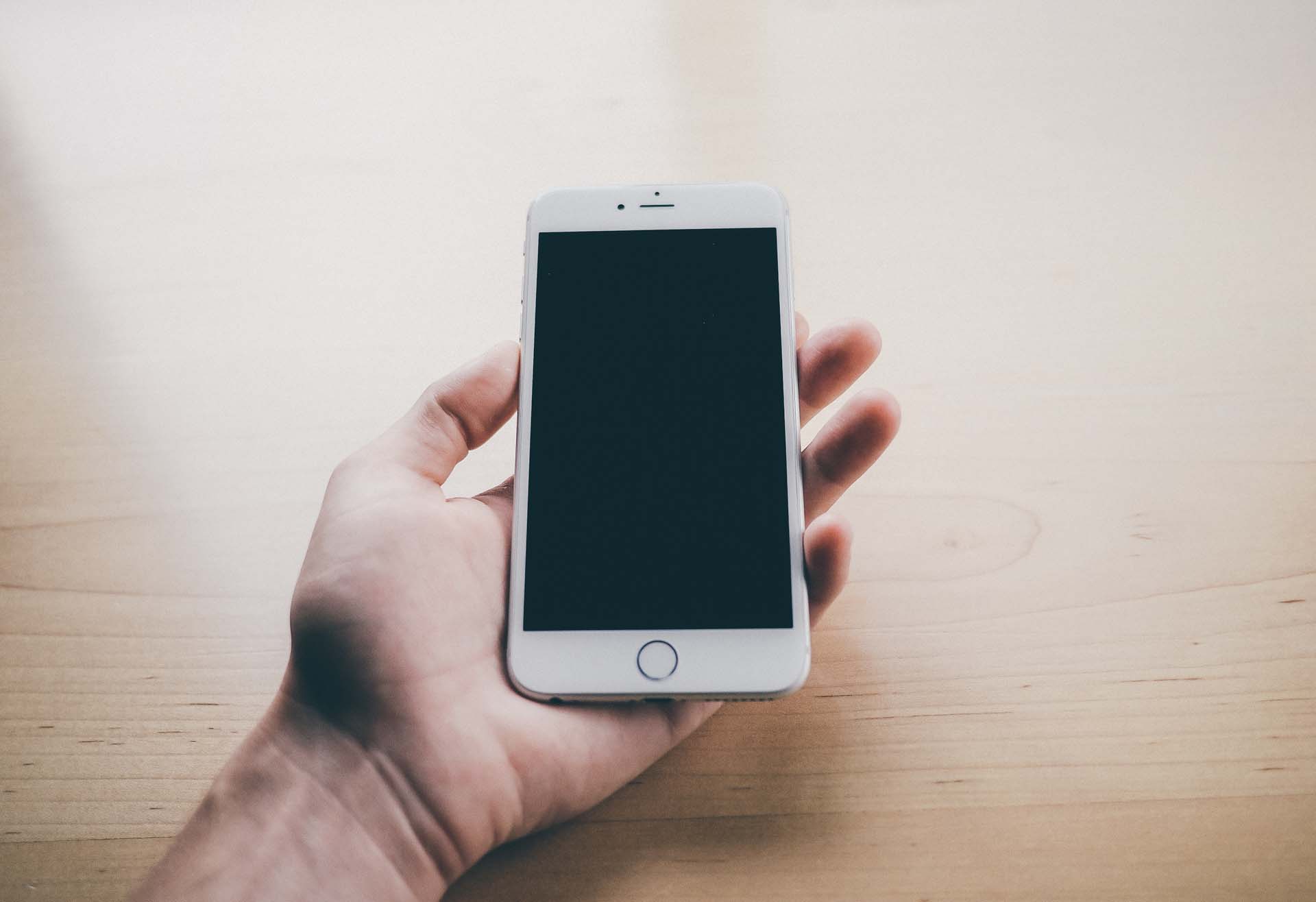
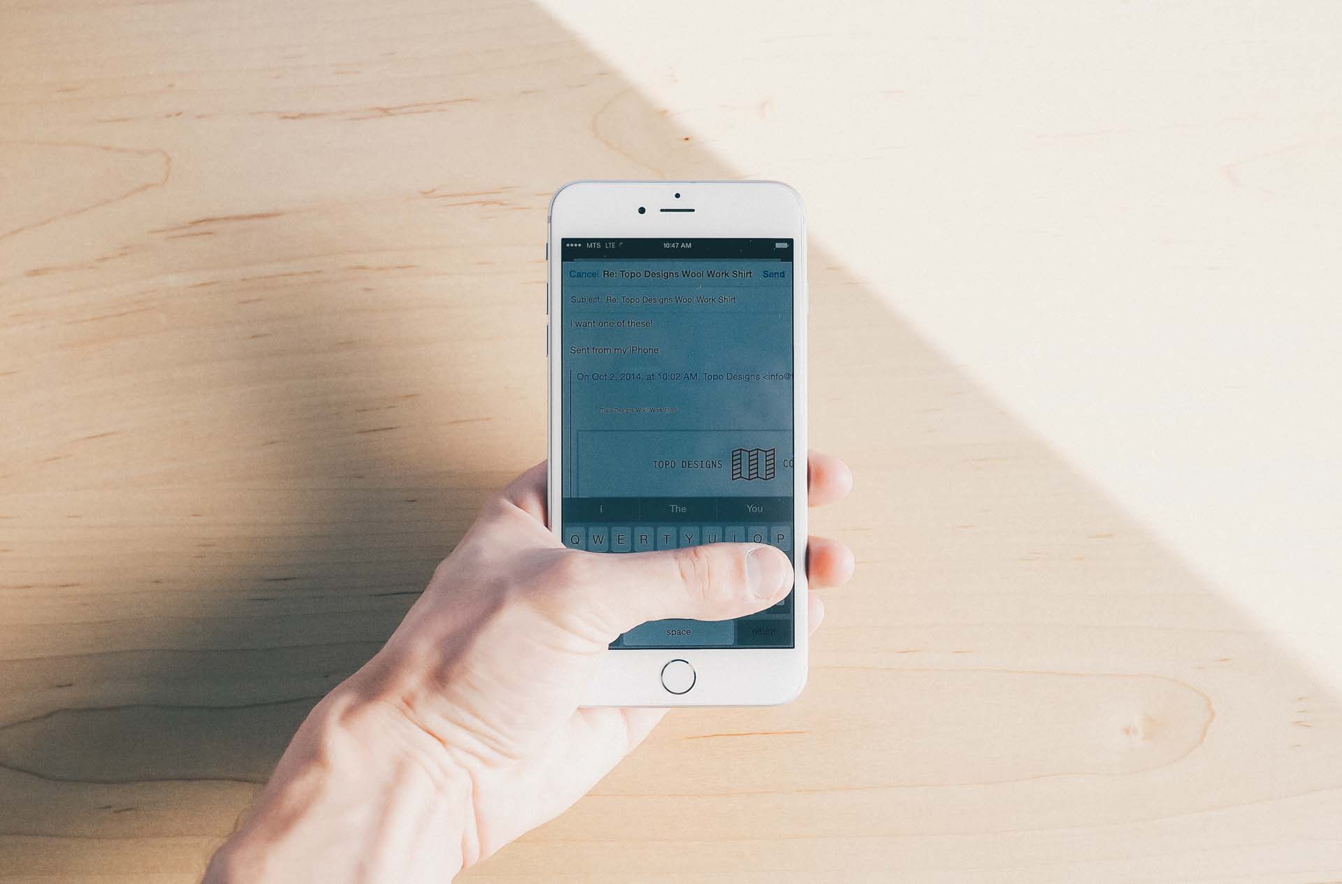
The amount of screen space that sits above and beyond the tips of your thumbs when typing on the new 6 Plus was particularly striking to me. I became used to pulling back my thumbs in order to see the majority of the screen on my old iPhone 5. Now, I can comfortably hover my thumb across the bottom of the screen and still have plenty of screen space above for reading and viewing. I've found this to take stress off my thumbs and has allowed for a more comfortable experience.
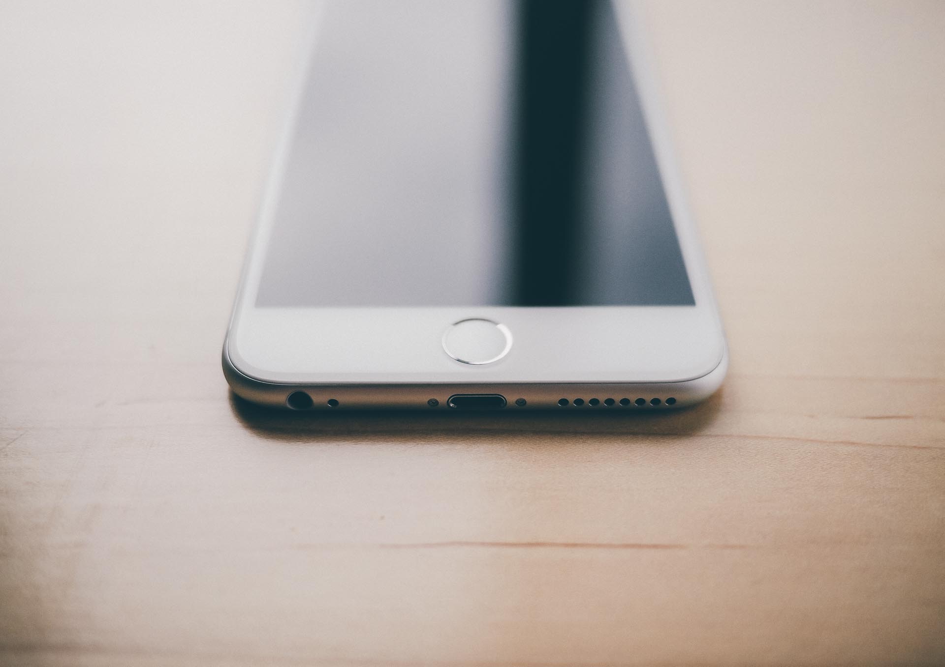
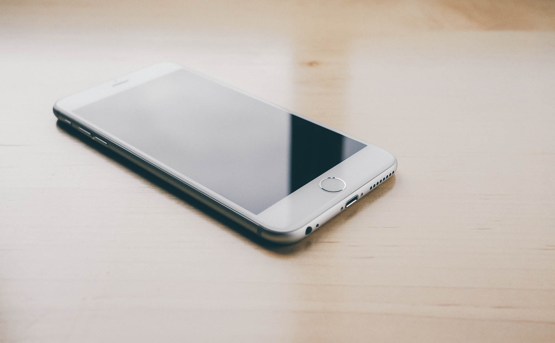
The 6 Plus comes with the standard Lightning port and a few extra external speaker holes on the bottom of the body. The external speaker is far superior to any prior iPhone, so much so that I have yet to plug in a set of headphones. Unless the external speaker becomes distracting at the office (which it's entirely capable of doing), I don't see myself using the headphone jack all that often.
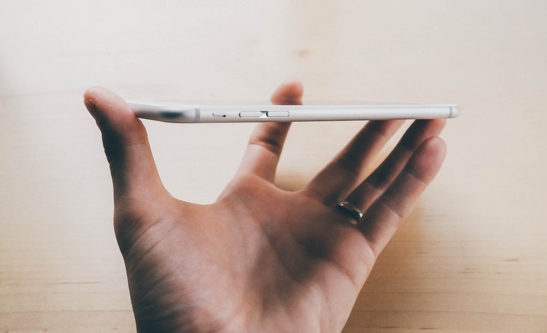
The left side of the phone has been redesigned. The volume buttons have been elongated and the mute/vibrate switch has been altered to have a more satisfying click. Actually, every button on these new iPhones click with absolute perfection. I avoided using my iPhone 5's physical buttons in fear of ruining them over time. Fast forward to today, and I'm now clicking buttons for the sake of clicking them.
Moreover, the vibration motors have been changed and my morning alarm now sounds like a freight train crashing through the wall. There's definitely a benefit to a louder vibration in your pocket, but the mute/vibrate switch has become less mute and more vibrate.
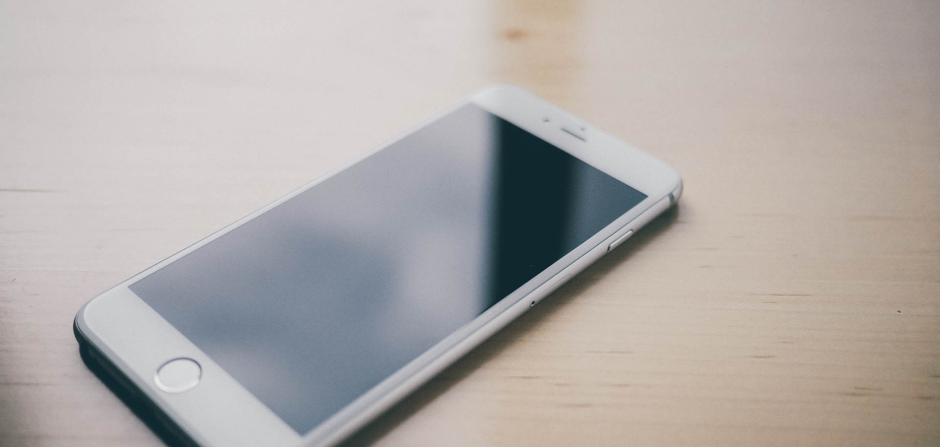
The right side of the iPhone now houses the sleep/wake button. Many have commented on how hard it was to become accustomed to the side button, yet I haven't had much of a problem. Worse, I now go hunting for that side button on my iPad. Funny how things change.
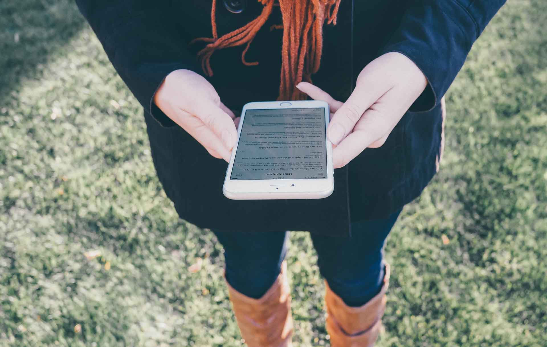
Also, now that the sleep/wake button has been moved to the side, the top of the iPhone is bare. I'm blown away by the classiness of this sleep/wake change. My ideal iPhone would have no buttons or SIM card trays obscuring the perfectly rounded edge. This top edge is as close as I've come to perfection.
Touch ID was introduced with the iPhone 5S, so the 6 Plus is my first experience with the unique fingerprint scanning feature.
Two weeks into Touch ID and it is easily my favourite new feature. Unlocking the phone is buttery smooth and Touch ID's accuracy is mind-numbingly spot on. Prior to the unveiling of the iPhone 5S, I remember reading the rumour mill and concluding the fingerprint scanner to be a gimmick feature.
Boy was I wrong.
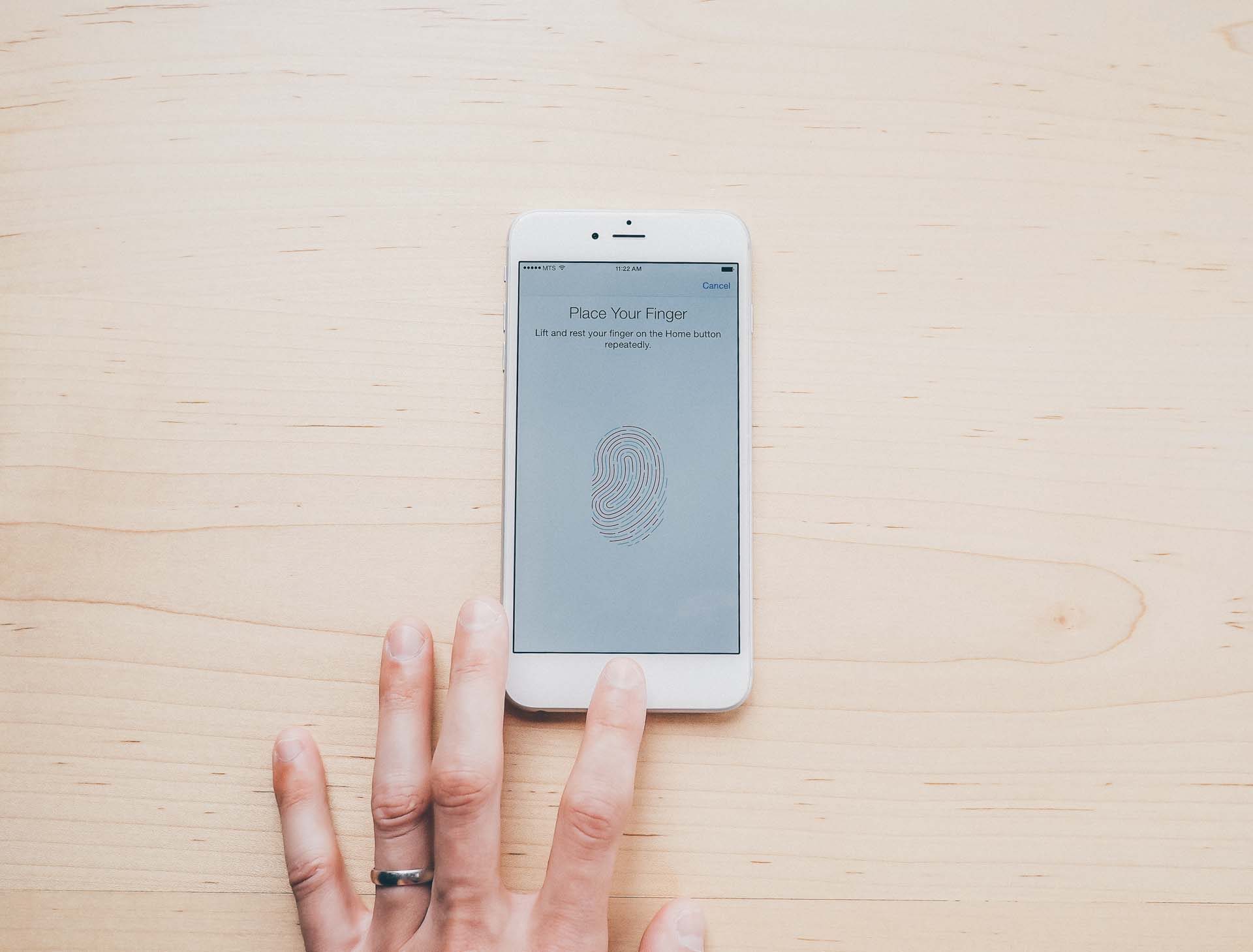
And best of all, iOS 8's Touch ID features allow my favourite apps to tap into the fingerprint scanner's security. Prior to iOS 8 and the iPhone 6 Plus, 1Password was one of those apps on my homescreen that I had to have but never truly used. Now, 1Password is used 15 to 20 times a day.
The 6 Plus's home button isn't too shabby either. I find the clickier home button to be more satisfying and more responsive than my previous iPhone 5. After seven iterations of the home button, I'm glad to see Apple has perfected this iconic button.
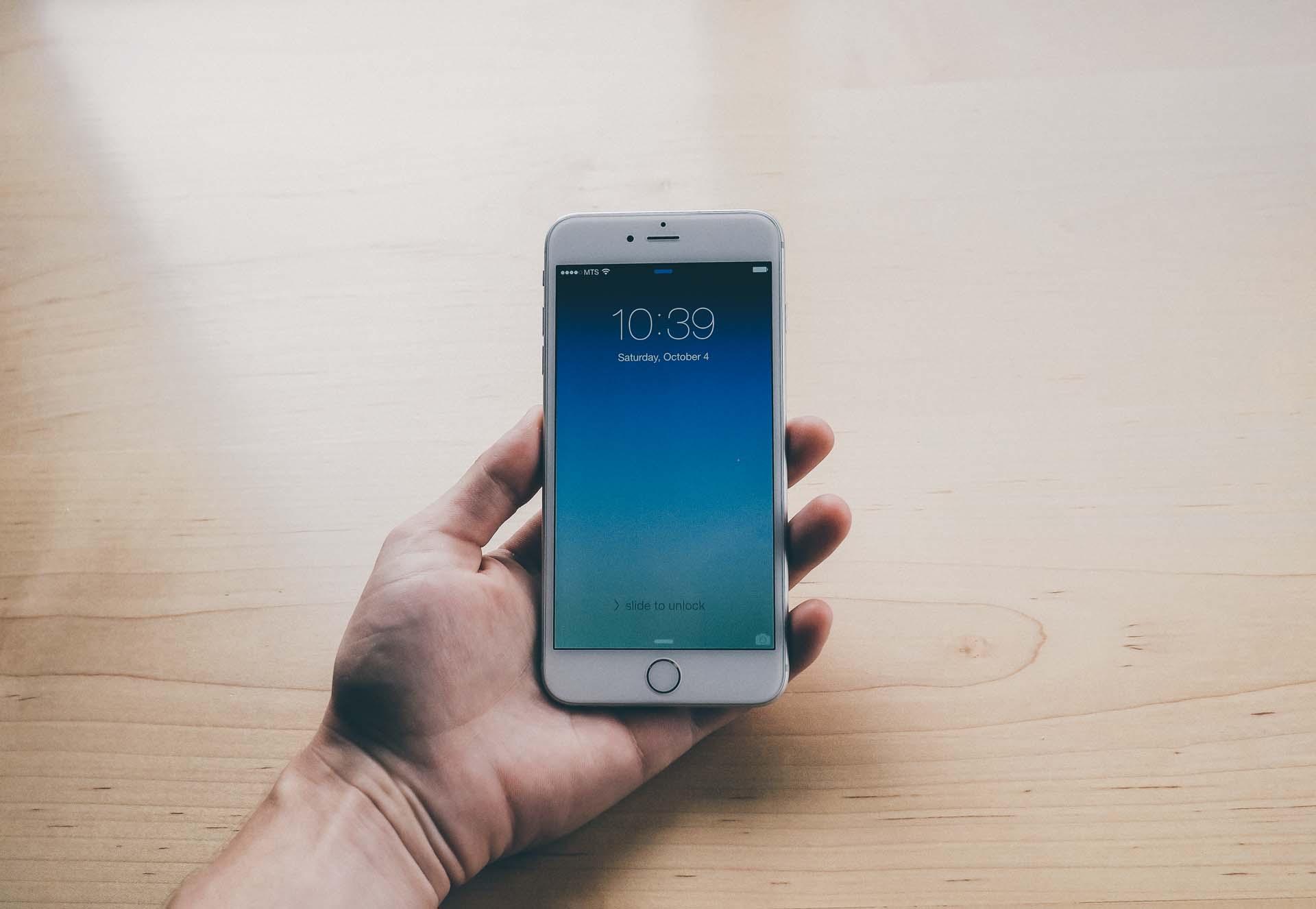
Of course, the star performer of this show is that beautifully gigantic 5.5" screen. I believe the specification goes something like "401 PPI", which means sharp in English. Text floats microns under the glass and every bit of the screen is perfectly sharp. I've been able to find details in my photographs that I normally would only see on my Retina MacBook Pro. Reading text is so easy on the eyes. Colours pop even better than before. I could go on forever about this screen.
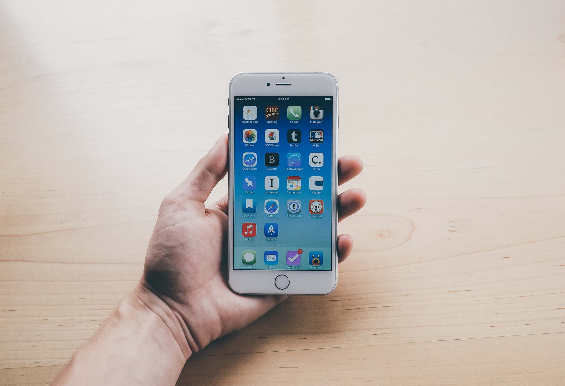
And what would a new iPhone be without an extra row of app icons? I can now fit every single app I actually use on my first homescreen. Further, more apps can be fit on the iPhone homescreen than on the iPad homescreen.
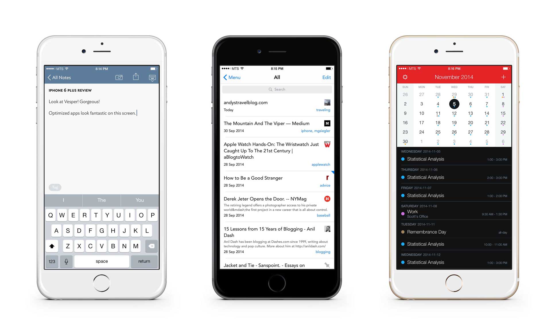
Left to right: Vesper, Pinner, and Fantastical
Developers have yet to fully embrace the enormity of the 6 Plus's screen. Between the tight launch schedule and the reality of needing to redesign for a larger screen, I don't blame anyone for being patient.
When the apps are updated, however, they look fantastic.
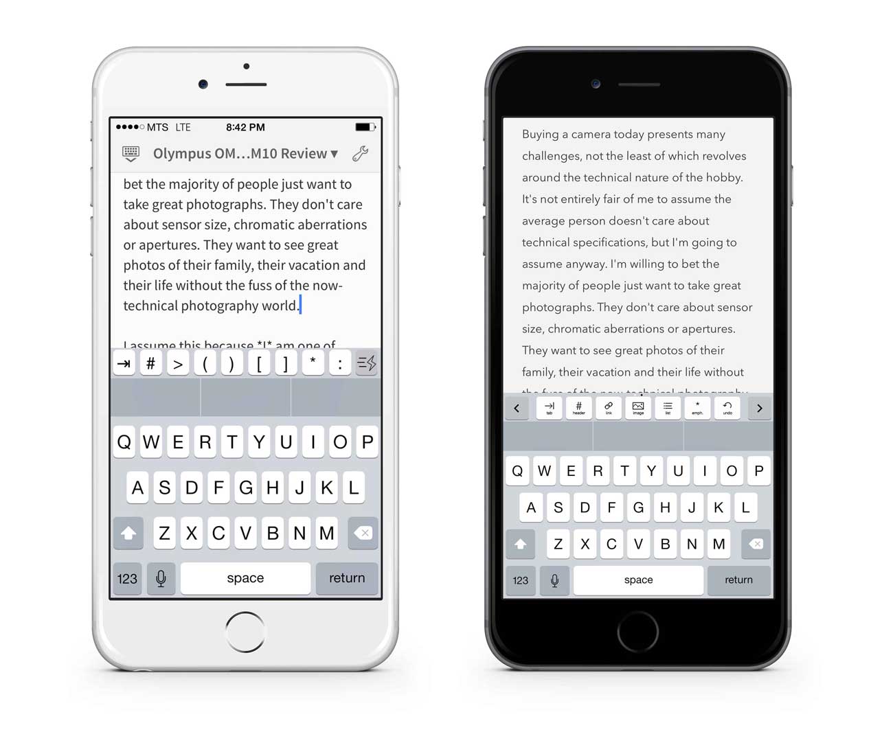
Editorial on the left and Byword on the right.
Unoptomized apps aren't completely unusable, but I would rather have seen shrunken down versions of an app like we saw with the transition from iPhone 4S to iPhone 5. Instead of normally sized touch targets, Apple decided to blow up the interface. Text is blurry, keyboards are humongous and photos are far from sharp. The ball is in the developer's court, and I wouldn't hold my breath in many instances.
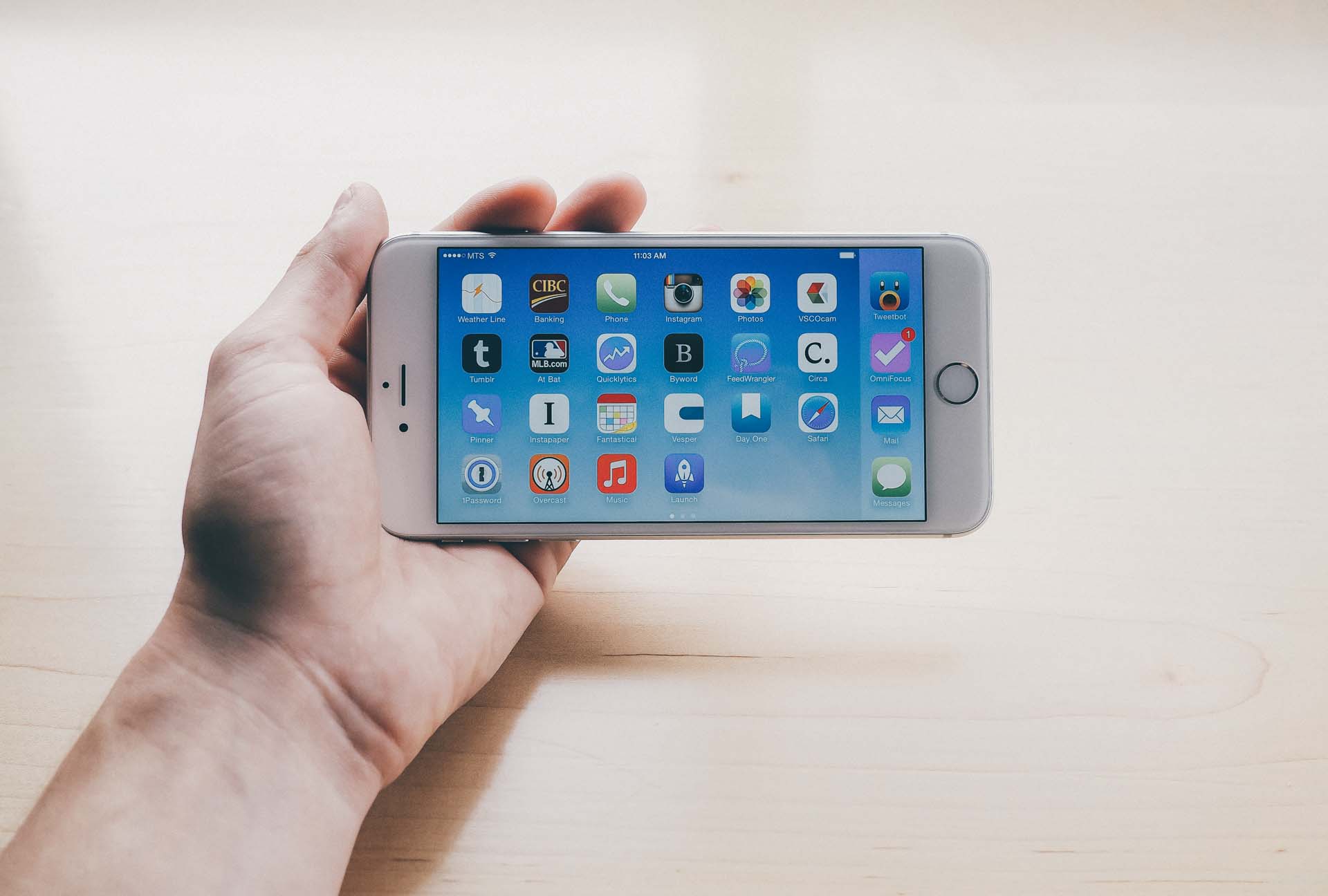
Unique to the iPhone 6 Plus is a set of landscape orientation features. I have yet to actually use any iPhone in landscape, so these features are lost on me.
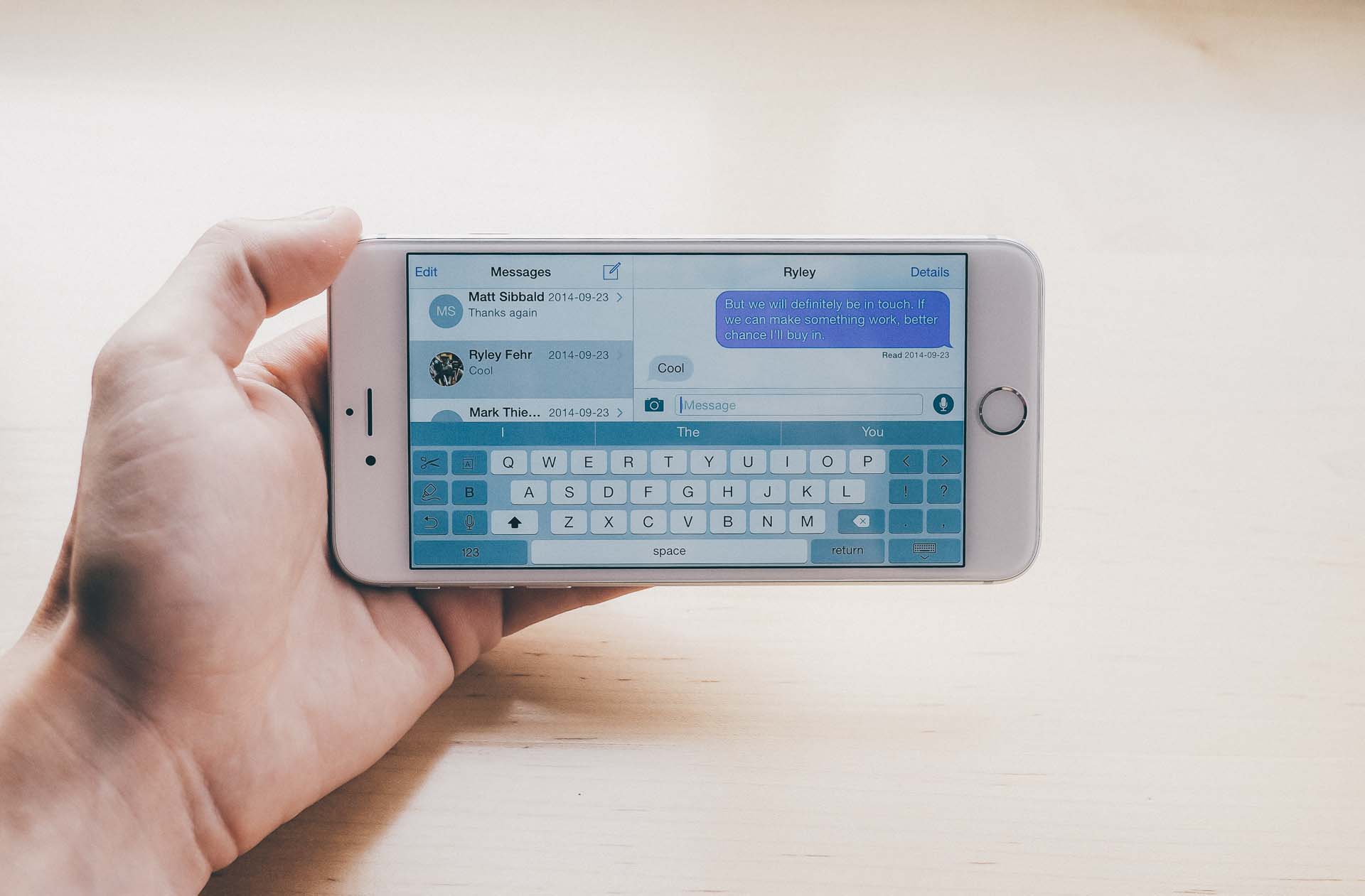
Just look at that landscape keyboard! The backspace and shift buttons have been moved to the middle of the screen and other buttons have been added to the outside. Some of Apple's apps have also been given an iPad-esque split-screen view. While the split-screen view can be helpful at times, the landscape keyboard is probably the worst piece of software design I've ever seen shipped out of Apple's doors. I hope they fix this shortly.
Last but not least, the camera. Oh the camera! So much has been said about the iPhone 6 Plus's camera and there's no way I can possibly do the camera justice in a few short paragraphs.
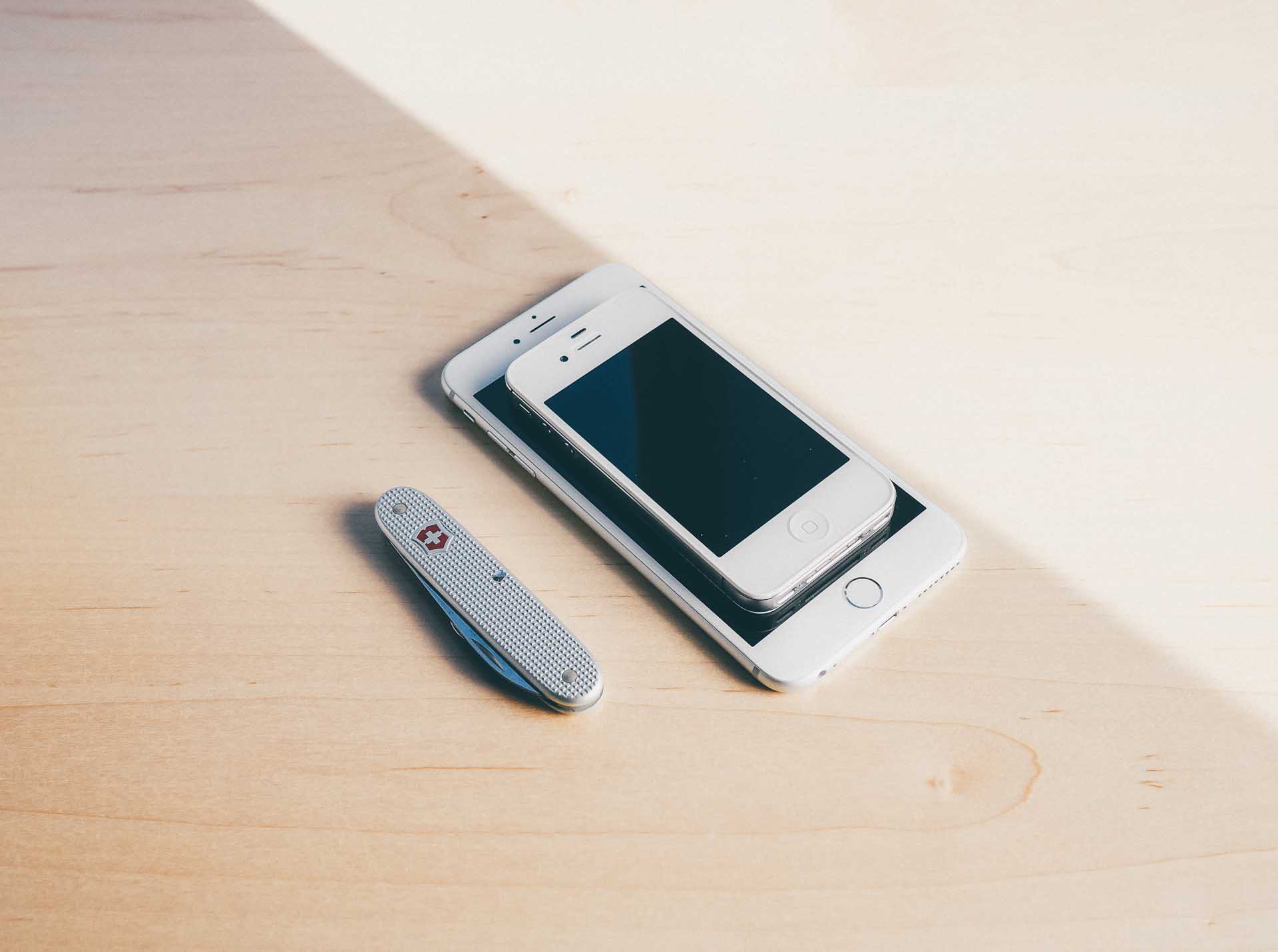
Quite clearly, both the iPhone 6 and 6 Plus have cameras that extend beyond the body chassis. The "camera bump" seems to be a cause for irritation across the web. People are very worried about scratching the camera by laying the phone on its back and, perhaps more annoyingly, the phone doesn't lay perfectly flat.
Yet, the camera is covered by sapphire crystal and is rock solid. If you haven't seen the incredible durability of sapphire crystal, you should check out this video. If you can't scratch the lens with a brand new pocket knife, I don't think your flat surface will damage anything of value.
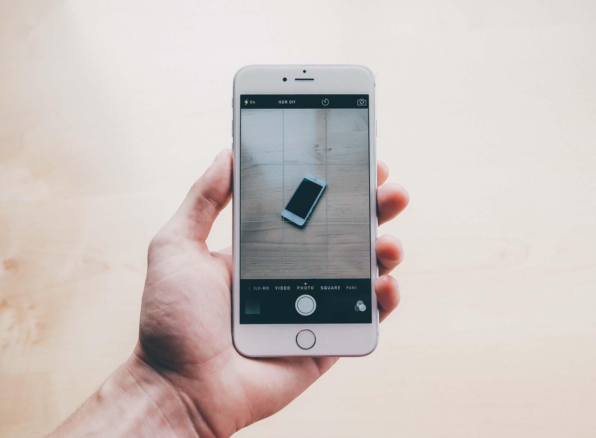
With that out of the way, we can get to the meat and potatoes of the iPhone 6 Plus's camera. It has an 8 megapixel camera, a constant f/2.2 aperture, and optical image stabilization (6 Plus only; the iPhone 6 does not have optical image stabilization). Realistically, these stats mean very little to most people and the true interest lies in the quality of the photos it can capture.
Luckily, Austin Mann has everyone covered. His photography test in Iceland is simply jawdropping and nothing I can shoot will ever measure up. Quickly head over and check it out.
In the meantime, I've attached four images I've shot since I purchased the 6 Plus. I rarely use my phone to take photos as my Olympus is still heads and tails ahead of any smartphone camera on the market. Regardless, it's great to know that I have such a good camera on my person wherever I go.
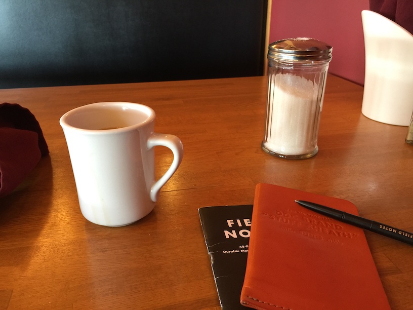
I am very pleased with the low light clarity and noise control. Although simple, this restaurant wasn't lit well and this photo turned out sharp and free of noisy blotches.


Framing photos is extremely easy as the 5.5" screen makes an excellent viewfinder. The size of the 6 Plus's body can make snapping photos unwieldy at times, but this is more than made up for with that beautiful viewfinder.
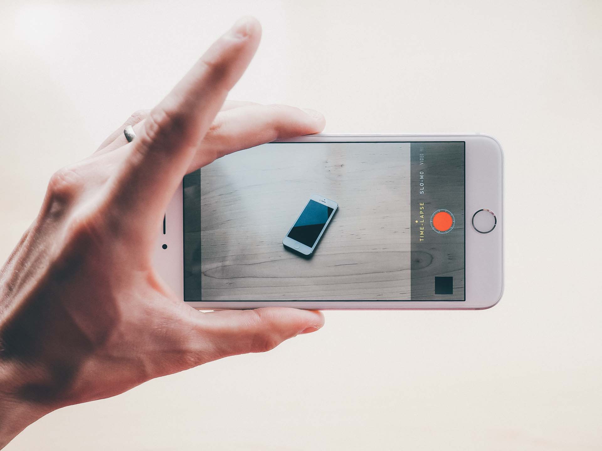
Best of all, the newest iPhones come with incredible features for shooting slow motion video and time-lapse photography. I've played around with both features and have found I'm not artistic enough to do them justice. They are a pile of fun to experiment with and their ease of use is second to none. As always, it's a combination of hardware and software that puts other major competitors at risk.
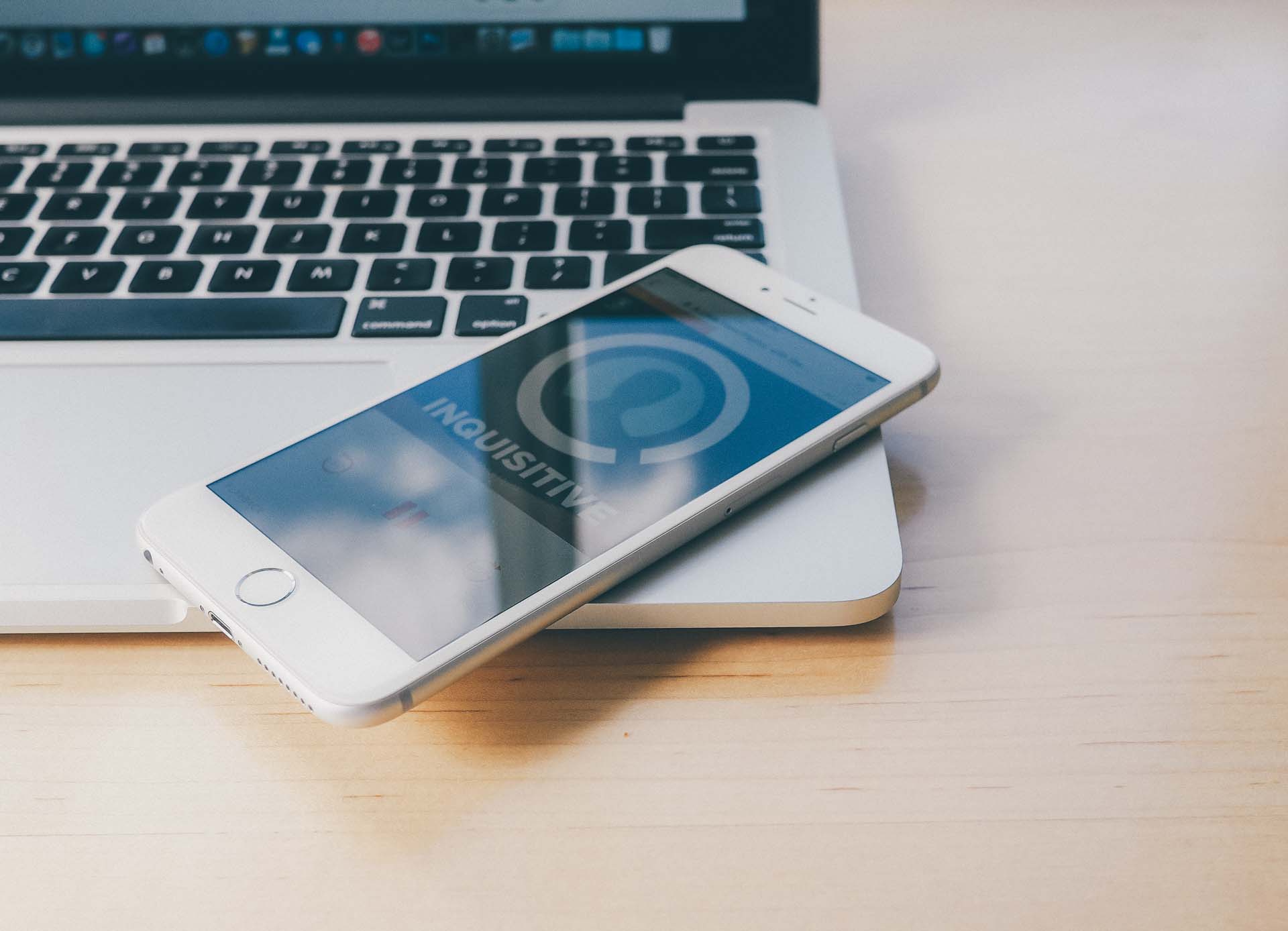
Without a doubt, the iPhone 6 Plus will not be for everyone. Its big, slippery aluminum body is best used with two hands and carrying around a large phone can create new problems to consider about before walking out your front door.
At the same time, you can guarantee you won't see better battery life on any other iPhone model. You can also bet you won't find a better display or a better camera on a smartphone.
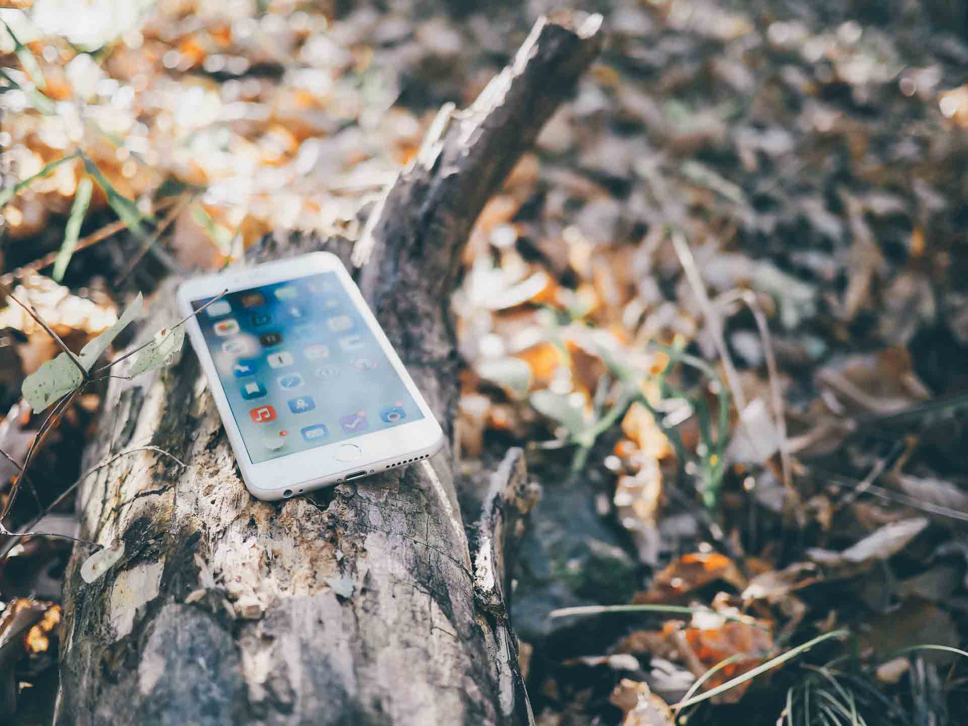
And that's the story so far of the iPhone 6 Plus. It's a device grounded in tradeoffs. You truly can't go wrong by snagging the 4.7" iPhone 6 and jumping into a one handed smartphone that is far more comfortable to transport around.
However, if you find yourself with the opportunity to use a phone two handed most of the time, I'm willing to bet the 6 Plus will be right up your alley.
Grab it. Play with it for five minutes. Then decide. I'm sure you'll know within that timeframe which phone is right for you.