I picked a bad time to purchase the Logitech MX Master.
All the sales and discounts should have pointed me to the pending update in the midst. The fact the MX Master had been available for so long should have been the second clue.
Of course, none of that stopped me.
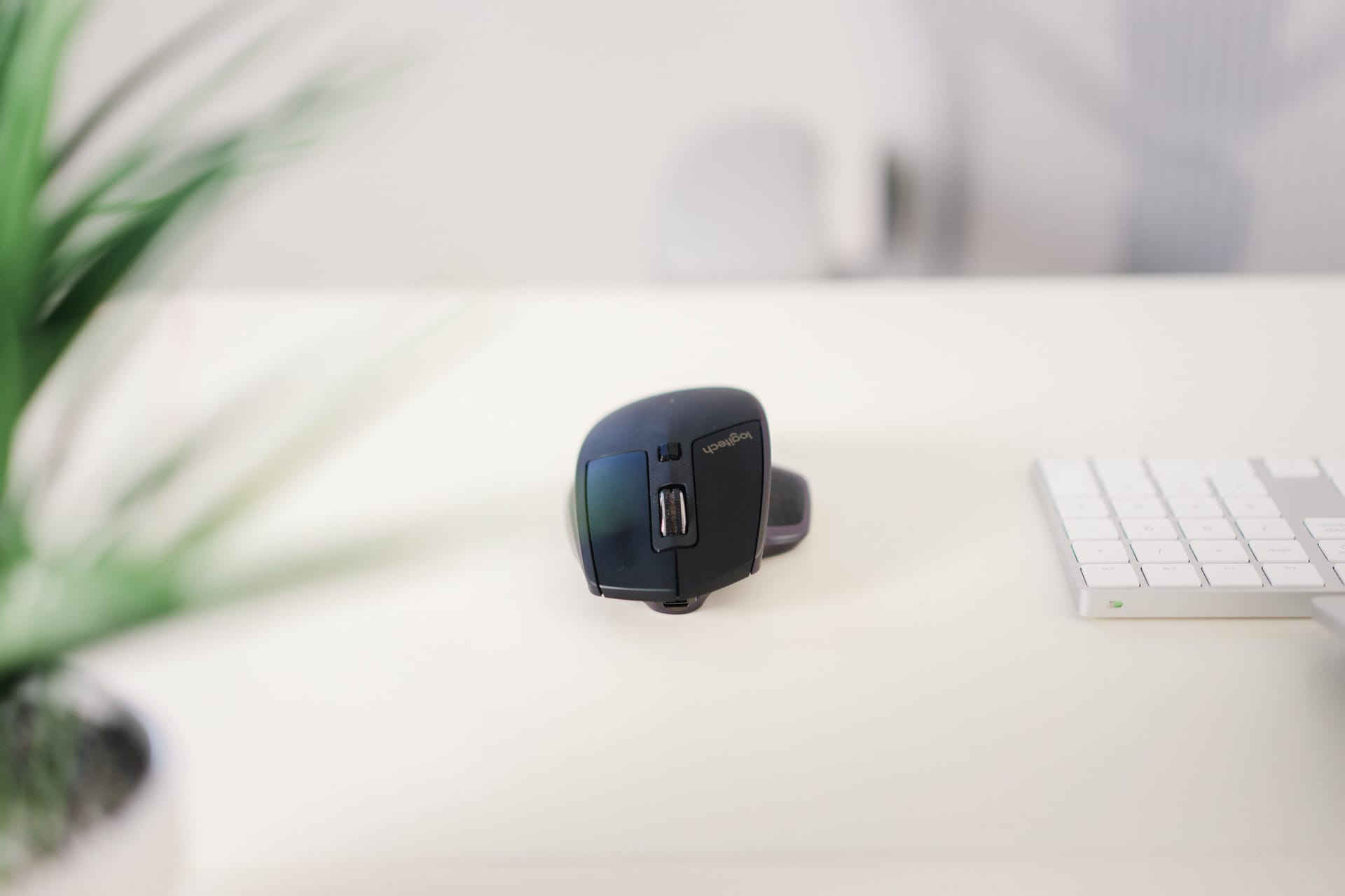
The [Logitech MX Master mouse](https://www.amazon.com/Logitech-Master-Wireless-Mouse-Computer/dp/B00TZR3WRM/ref=sr_1_1?sr=8-1&ie=UTF8&keywords=logitech%25252Bmx%25252Bmaster%25252Bmouse&tag=toolstoystreview-20&qid=1498525704) — one of the most popular desktop mice available today.
When the MX Master 2S was announced, my response circulated in this sort of fashion:
- I just bought the MX Master and now there’s a new model? Josh! What were you thinking?
- Hey, the MX Master 2S looks almost identical to the MX Master.
- The reviews say the MX Master 2S has very few changes from the original MX Master.
- What’s this “Flow” feature? I’m not sure I would use this anyway.
- It’s $30 more expensive? Boy am I glad I went with the first generation mouse.
Sometimes you get lucky purchasing older generation hardware.
Aside from specialty pointing devices, Logitech reigns supreme in the mouse world. Ergonomic shapes. Sleek designs. Wide ranges of customization and button options. Logitech’s mice, be they portable/take-anywhere mice or mice for your desktop, have everything you could ask for.
In the desktop world, it started with the MX Revolution mouse. The MX Revolution came with thumb buttons and thumb scroll wheels, a sleek design, awesome battery life, and improved tracking capabilities. I was a high school kid at the time, but I always had the MX Revolution at the top of my hardware bucket list.

The Logitech MX Master mouse runs in a long line of Logitech's MX mouse history. By and large, the MX Master fixes nearly every issue of prior MX mice.
The Performance MX was created to improve on the MX Revolution, but I was largely disappointed. It included Logitech’s newer Unifying Receiver and further ergonomic and grip enhancements, but it eliminated the (clickable) thumb scroll wheel. Perhaps my views were skewed, but I felt like any worthwhile desktop mouse had to have a thumb scroll wheel.
After all was said and done though, the (now first generation) MX Master fixed my disappointments and has quickly become a mouse I cannot work without.
Design and Shape
All of Logitech’s MX mice have had ergonomic and sleek designs, and this continues with the MX Master.
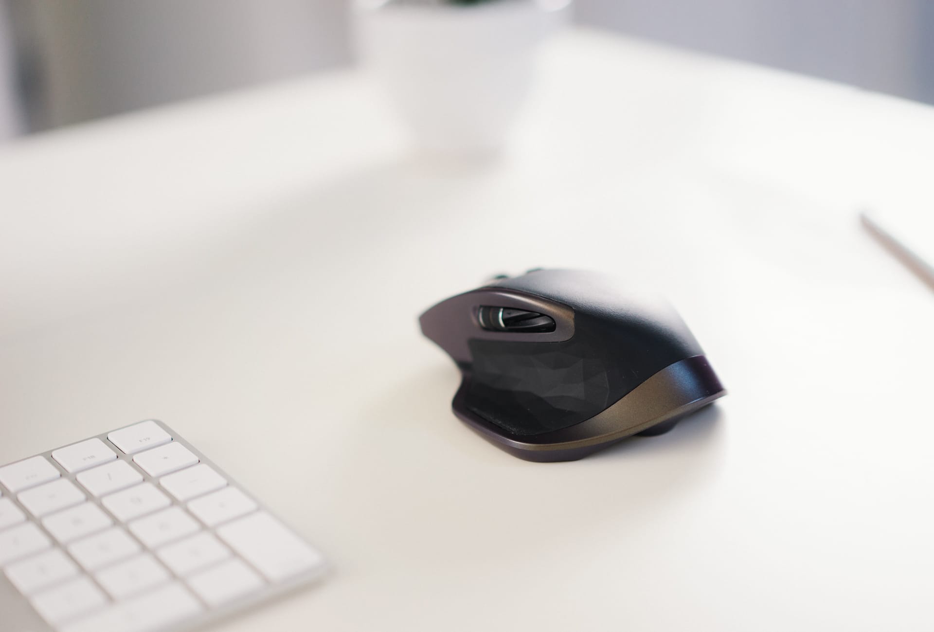
The MX Master has a maximal design, almost as though it was dropped off from outer space.
There’s nothing minimal about the MX Master’s design. It looks like a rocket ship or a streamlined car. The curves are smooth and elegant, but the lined thumb rest, the bronzed edges, and black exterior add up to a more “maximal” approach. You’d be hard-pressed to have the MX Master’s design fit inside the design scope of Apple’s white world.
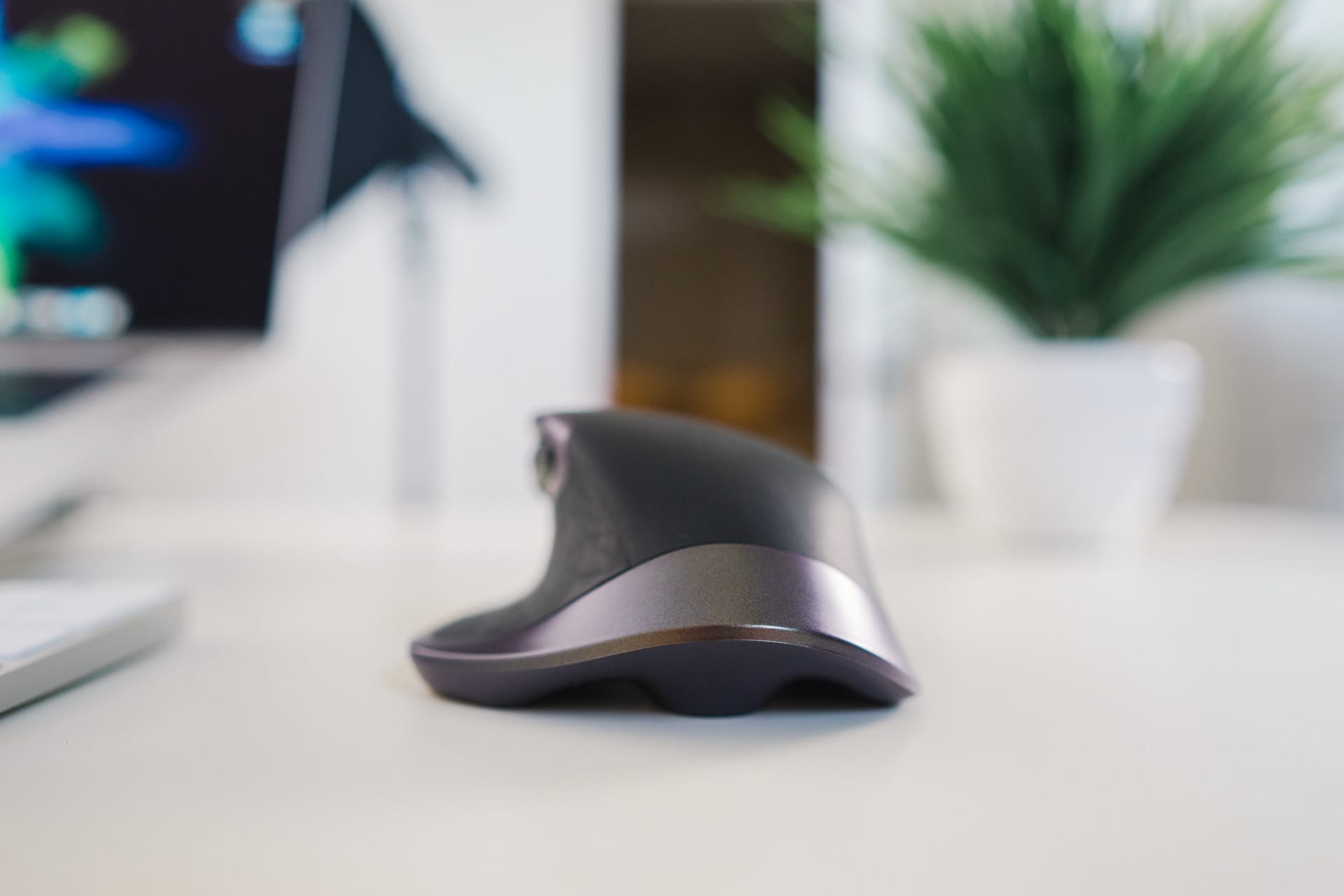
Despite the funky curves, the MX Master is extremely comfortable to use.
The MX Master’s shape is for palm-grippers — the mouse’s high grip firmly puts it into the muscular part of your hand between your thumb and index finger. This is my ergonomic design of choice, but may not fit those who prefer more front-loaded mice controlled by their fingertips. Plus, it’s for righties only.
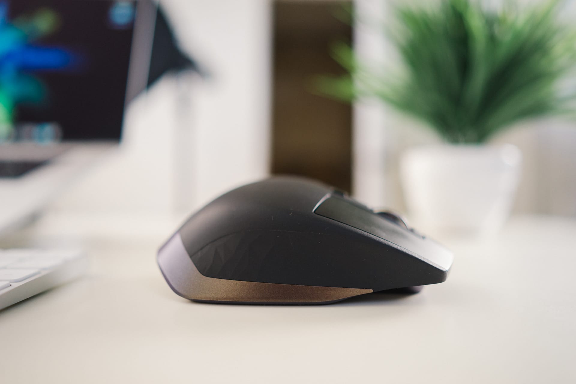
The unique design on the right side and thumb pad add both character and tactile grip for your thumb and pinky.
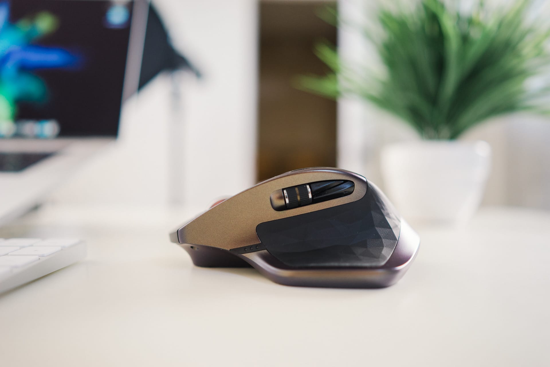
Believe it or not, this is a perpendicular shot of the MX Master. The back drops off pretty significantly, resulting in its palm grip.
The fall off of the MX Master’s back-end leaves a small gap between the base of my palm and the mouse, which tends to make me think the mouse was designed for someone with shorter fingers. If I find the grip I enjoy most, it results in my middle finger extending beyond the edge of the MX Master’s right-click button. Different hand shapes will have different mileage here, but it may be something you want to test out first.
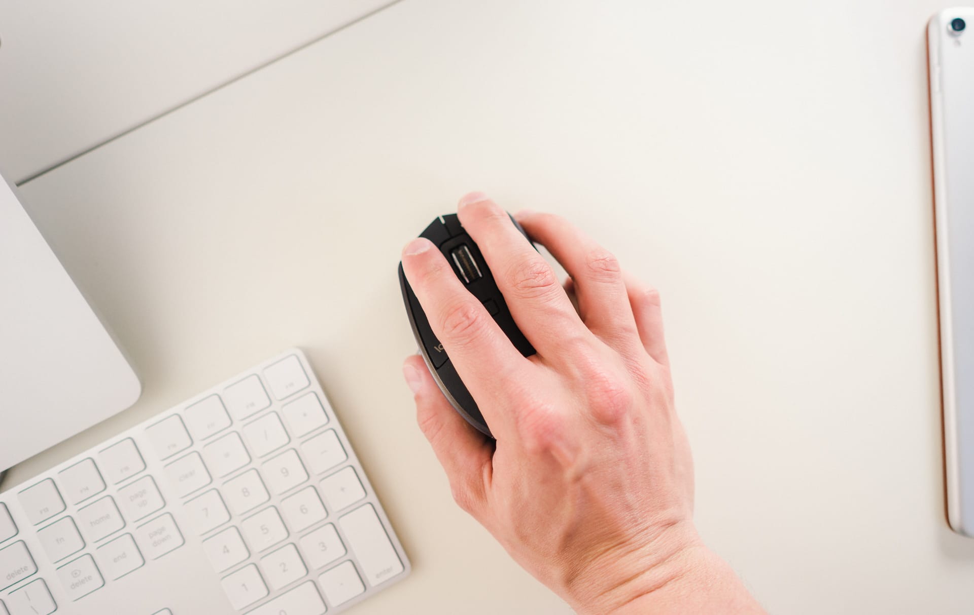
If I put the grip right into the base of my palm (where it's most comfortable), my middle finger extends slightly beyond the edge of the right-click button. This isn't the end of the world, but I do think the mouse might be slightly too small for my hand.
The high grip is a recipe for a large desktop footprint, which the MX Master certainly owns. This mouse is large, both in footprint and in height. Transporting the MX Master between the office and home each day is a nuisance and is better suited to Logitech’s more portable options. And, thanks to the MX Master’s height, you may inadvertently strike the mouse and knock it across your desk when you reach over from your keyboard. On countless occasions, I’ve been in the zone and want to rush to click on something, only to snag the crown of the mouse and send it almost flying off my desk.
These few nitpicks aside, the Logitech MX Master is single-handedly the most comfortable mouse I’ve used. Each curve and taper has been carefully chosen to fit as many hands as possible, while buttons have been placed in easy pressure points for your hand. I find there to be a calming effect — soothing, if you will — when you place your hand on the MX Master’s ergonomic shape.
Buttons
Like all the MX predecessors, the MX Master comes loaded with customizable buttons.
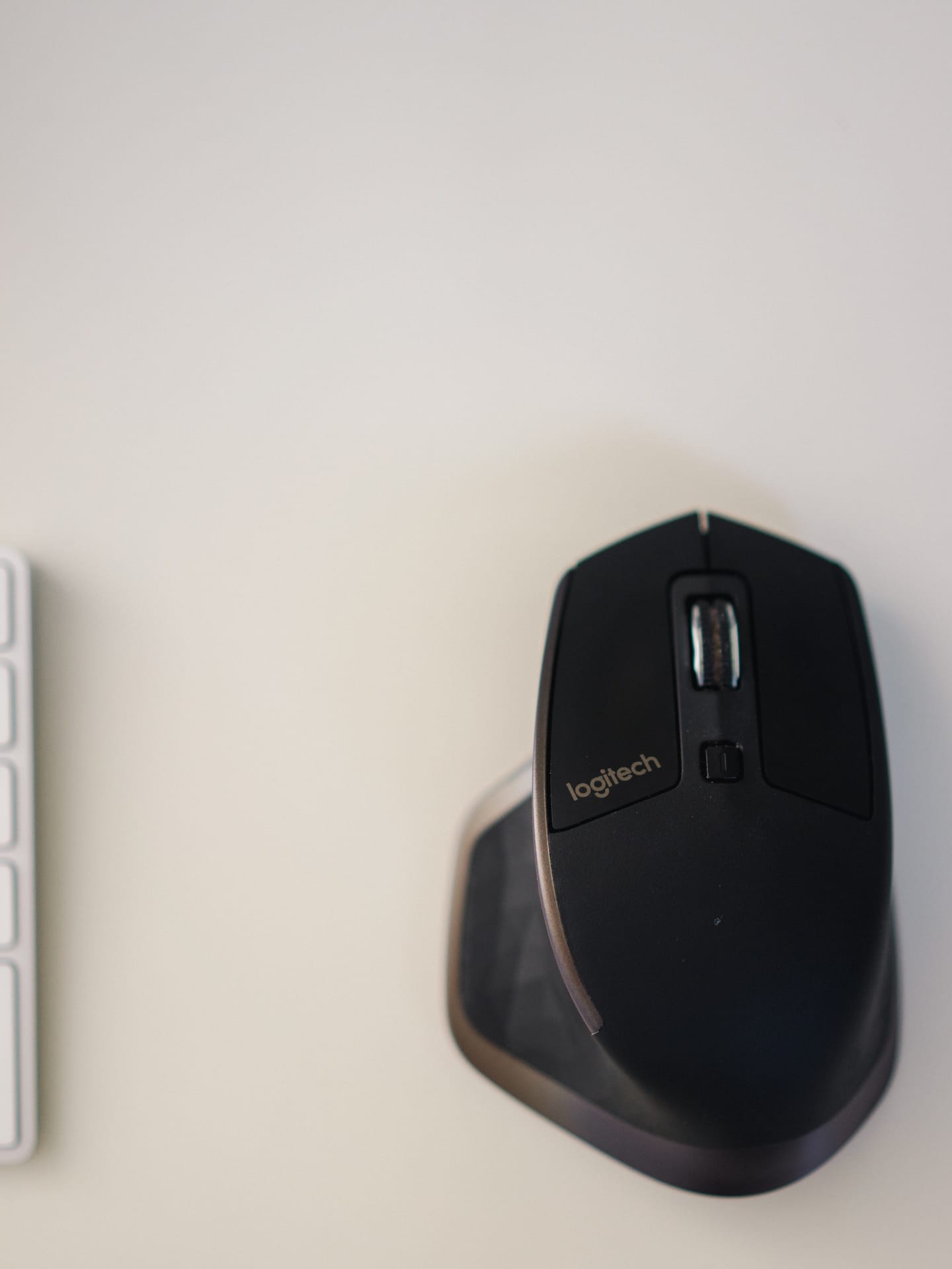
The MX Master's left and right click buttons are large and click with purpose.
The left and right click buttons are large and depress where an average fingertip’s pressure point lies. I’ve found too many mice put the optimal point of depression forward or backward of the pressure point in my index finger. Fortunately, the MX Master nails the spot, both in the left and right click buttons.
The top scroll wheel is large and clickable. When you depress the scroll wheel and (for Windows machines) use your gestures to scroll up and down in the window, it's very difficult to be precise. As a result, I rarely use the clickable scroll wheel feature.
Behind the scroll wheel is a simple button to lock and unlock the free-spinning scroll wheel. It clicks with good satisfaction and there is an audible noise to signify the locking mechanism. This button is quite neat overall, but serves only a single purpose.
The thumb rest is where most of the MX Master’s magic happens. A flick of the thumb spins the horizontal scroll wheel — which spins vertically rather than horizontally like the old MX Revolution — to scroll horizontally through apps like Final Cut Pro or Microsoft Excel. The thumb scroll wheel is not clickable and actually feels a bit imprecise, but adds enough utility to be a welcome addition.

A set of forward/back buttons and a horizontal scroll wheel are placed near the webbing of your index finger and thumb. The buttons are situated a little far back to press them without being a tad uncomfortable, but this does eliminate any unwanted button presses.
Behind the scroll wheel are forward and backward thumb buttons, namely for navigating through webpages. When connected to my work PC, I use the forward/back thumb buttons extensively to navigate through Windows Explorer and file structures, to the point I find it difficult to revert to any other pointing device. I have found the buttons to be positioned a little too far back for my liking, but I’ve not yet experienced any thumb cramping.
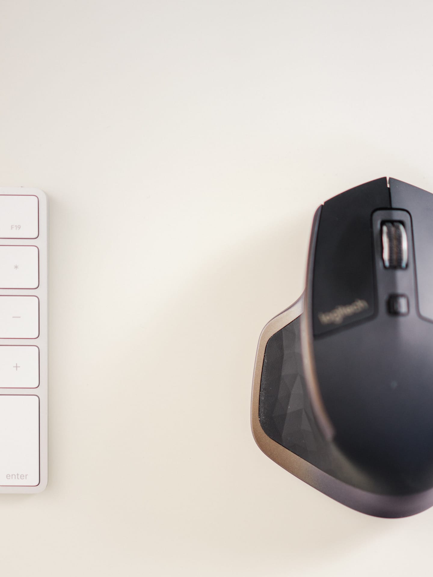
The ergonomic thumb pad is also a button, opening up a wide range of gesture controls in the OS.
Lastly, the thumb rest itself is a button. Depressing the thumb pad button brings the MX Master’s gesture controls to life. In macOS, pressing the thumb pad and pushing the mouse forward invokes Mission Control, pulling the mouse down invokes Exposé, and moving left or right scrolls between Spaces. Apple’s own Magic Mouse uses two finger gestures and taps to invoke these commands, but the MX Master’s thumb pad gesture control is a far superior way of navigating through macOS with a mouse. The gestures are less useful on my work PC, but my scope of navigation is much different on that computer.
Each button clicks appropriately and on command, with very few missed or inadvertent button presses. Aside from being a loud clicker, the MX Master’s buttons are well designed, positioned appropriately, and open up a faster way to navigate the OS for mouse users.
Scroll Wheel
The MX lineup of mice have always had unique scroll wheels. The MX Master’s scroll wheel continues the trend.
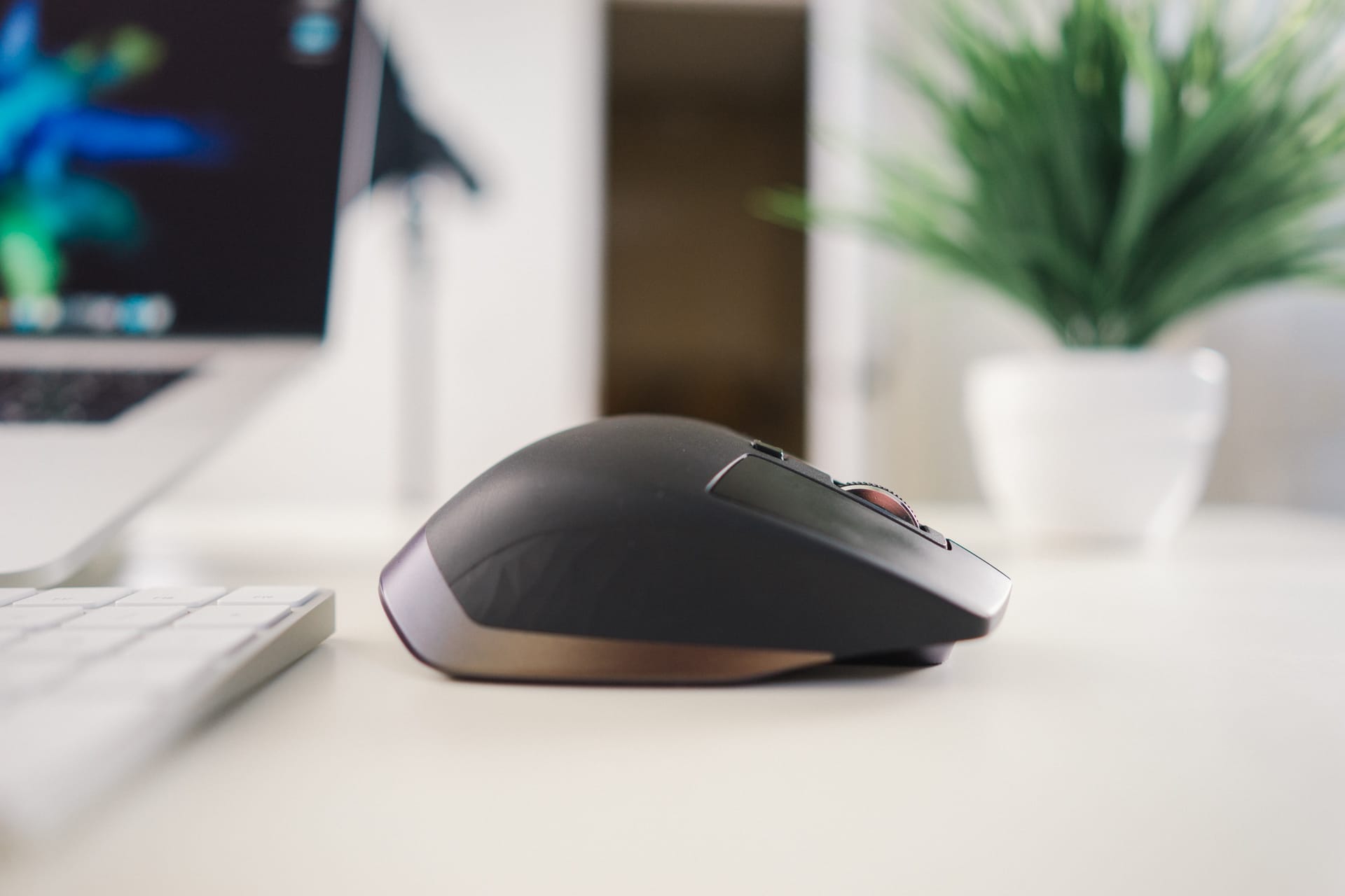
The MX Master's scroll wheel is incredible.
For one, it’s clickable.
For two, the scroll wheel is speed-adaptive. If you need to quickly scroll through a long article or a long timeline, a quick flick of the scroll wheel puts it into hyper scrolling mode. Flick your finger and let the scroll wheel fly to the point you need.
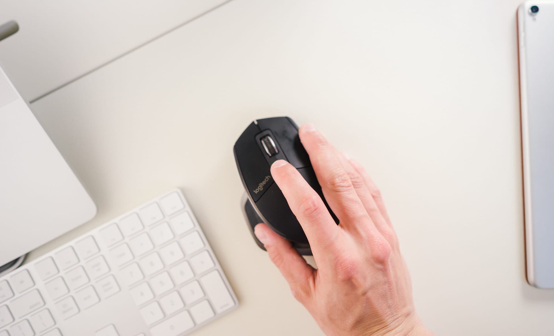
By flicking the scroll wheel, you can enter into hyper scrolling mode to fast forward through long documents or timelines. You can also press the button below wheel to enter hyper scrolling without flicking the scroll wheel.
Hyper scrolling can be imprecise. When working on my work PC, there are some programs which can’t keep up to the speed of the MX Master’s scrolling. After the wheel spins for a few seconds and I've stopped it with my finger, some programs lag (sometimes significantly) behind the scroll. I find the behaviour more prevalent on the work PC and only rarely experience the lag on macOS, but it’s definitely there.
Thumb Pad
I love the MX Master’s thumb pad button. It opens up macOS unlike any other mouse I’ve tried and inches ever closer to the gesture-heavy trackpad.
As mentioned above, depressing the thumb pad button and gesturing up, down, left or right invokes quick navigation commands. At home, I don’t have an external display to work with, so macOS’s Spaces — or multiple desktops — are heavily used. Flipping between desktops is a breeze and comfortable to boot.
Comfortable is the key word here. With Apple’s Magic Mouse, swiping between desktops involves moving your index and middle finger left and right in non-natural movements. As a whole, there’s nothing comfortable about any of the Magic Mouse's gestures, but the Magic Mouse’s desktop switching is the worst of the bunch. The MX Master involves depressing a button and using your wrist to move between desktops. It’s more natural, more comfortable, more precise, and faster.
Score one for the MX Master.
Darkfield Laser Tracking
When I first put the MX Master onto the glass covering on my desk at the office, I couldn’t believe I could control the pointer without a mouse pad. Glass has always been the bane of laser mice.
Thanks to Logitech’s over-the-top-named Darkfield Laser Tracking, mouse pads can be a thing of the past. So long as your surface is more than 4 millimetres thick, the MX Master will be able to track your movements. It’s an impressive feat, and one to keep glass-heavy decor lovers happy.
Connectivity
The MX Master connects via Bluetooth or Logitech’s Unifying Receiver, ensuring any and all computers can connect to the mouse.
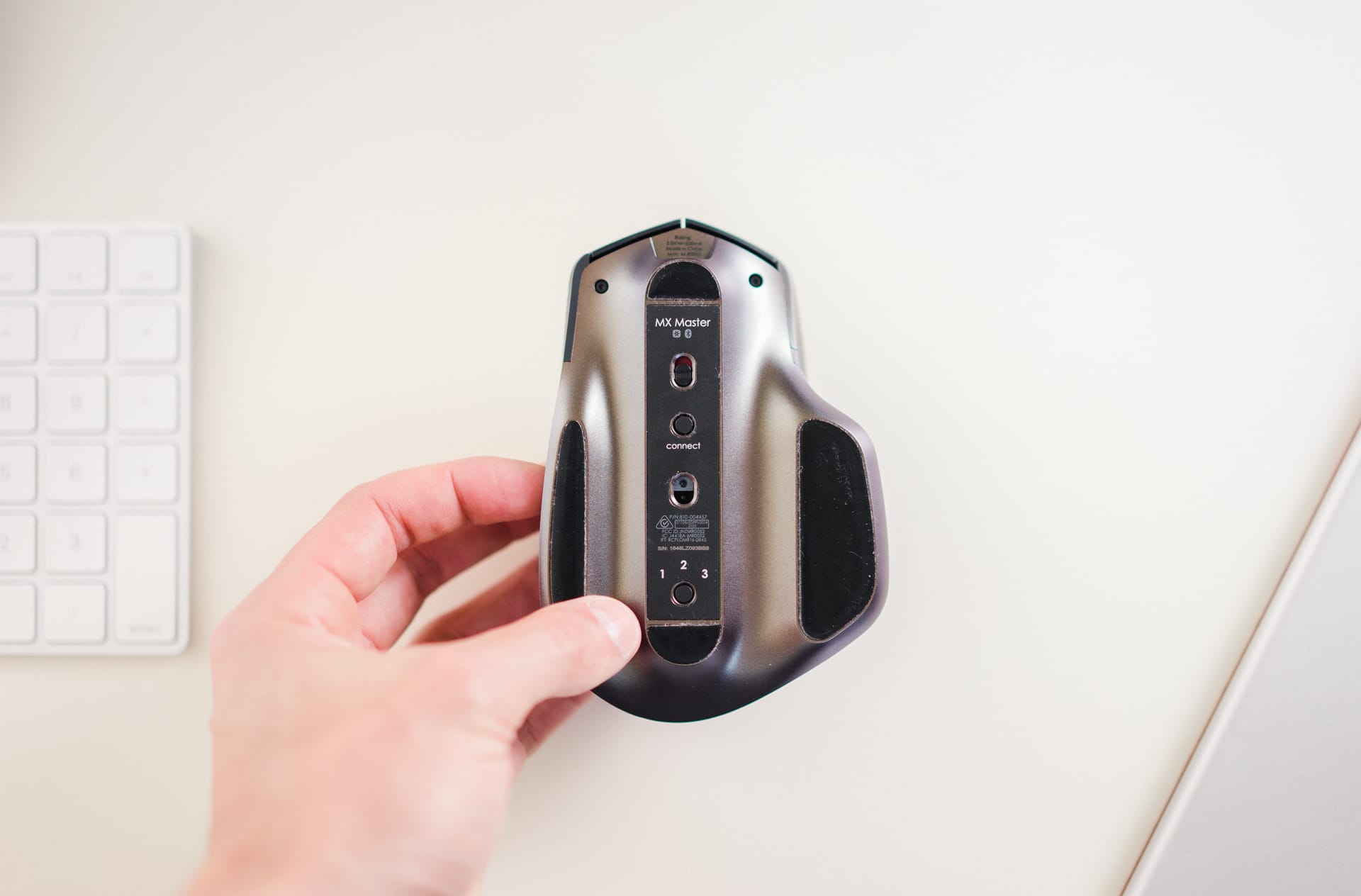
Underneath, you'll find an on/off switch, a "Connect" button to enter Bluetooth pairing mode, and a button enabling you to scroll through three pre-programmed devices.
Pressing a button on the bottom of the MX Master lets you program the mouse to three different devices. Once programmed, you press the button to scroll through the programmed devices and jump over the dreadful Bluetooth pairing process. I jump back and forth between options 1 and 2 quite often, and the experience is always smooth.
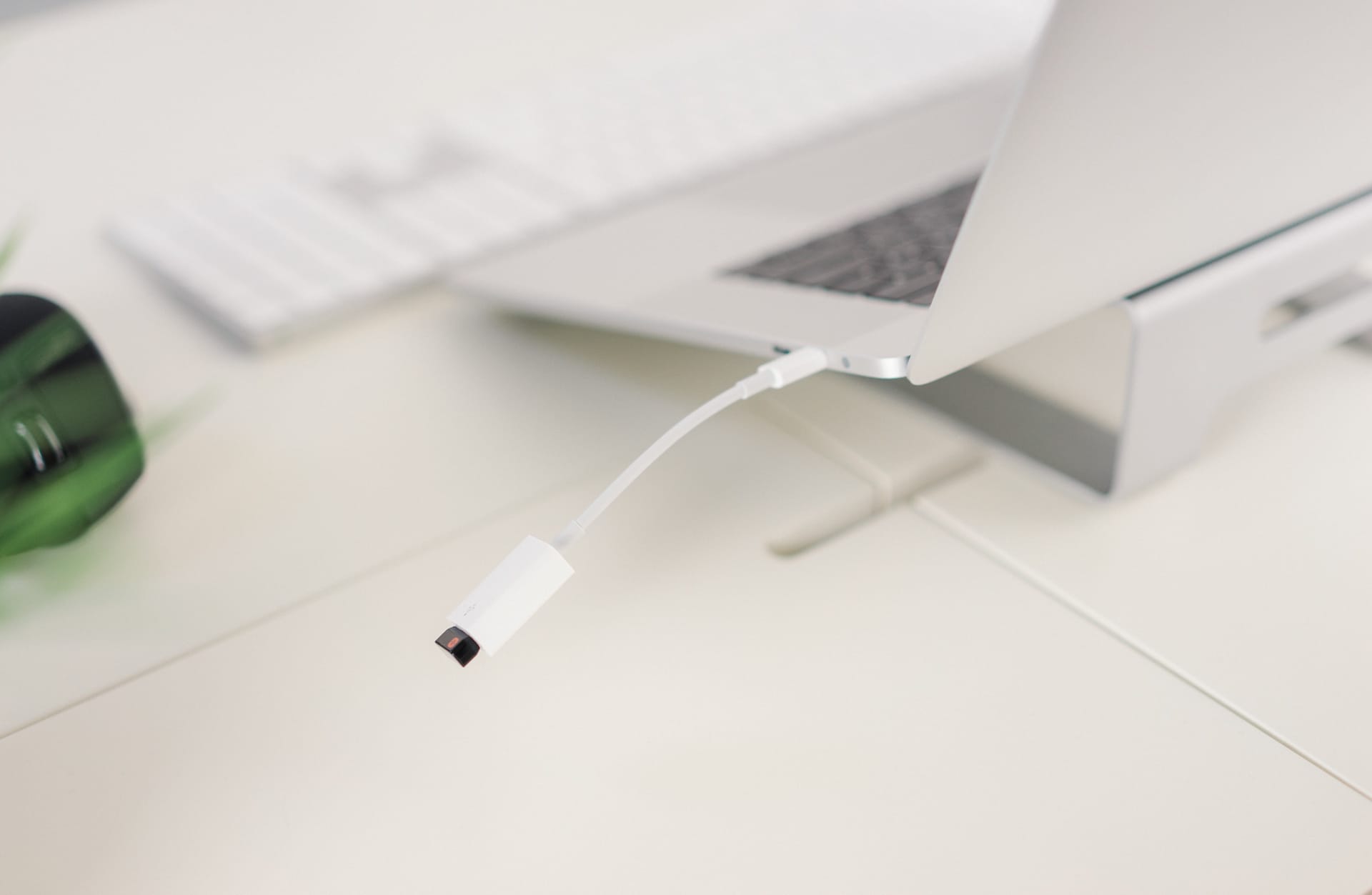
The Unifying Receiver is much more reliant than Bluetooth, but it gobbles up a USB port (or in the case of the MacBook Pro, a USB-C port with awkward adapter).

If your computer has available USB-A ports, the Unifying Receiver is small and easy to forget if its plugged in.
This is anecdotal at best, but in my experience, the MX Master performs far better when the Unifying Receiver is used rather than Bluetooth. My personal laptop is a 2016 MacBook Pro and my work laptop a colossal HP something-or-other; I’d say the mouse is more precise on the HP laptop with Unifying Receiver than it is when connected via Bluetooth to the MacBook Pro.
Again, this is anecdotal at best. But, if I have the option to connect via the Unifying Receiver without impeding on USB ports (or needing a USB-C adapter), I would always choose the Unifying Receiver over Bluetooth-only.
Logitech Options
All the MX Master’s customization options are managed inside Logitech Options, Logitech’s macOS and Windows app. Inside Logitech Options, you can customize any button to complete a wide range of tasks and you can assign app-specific controls as well.
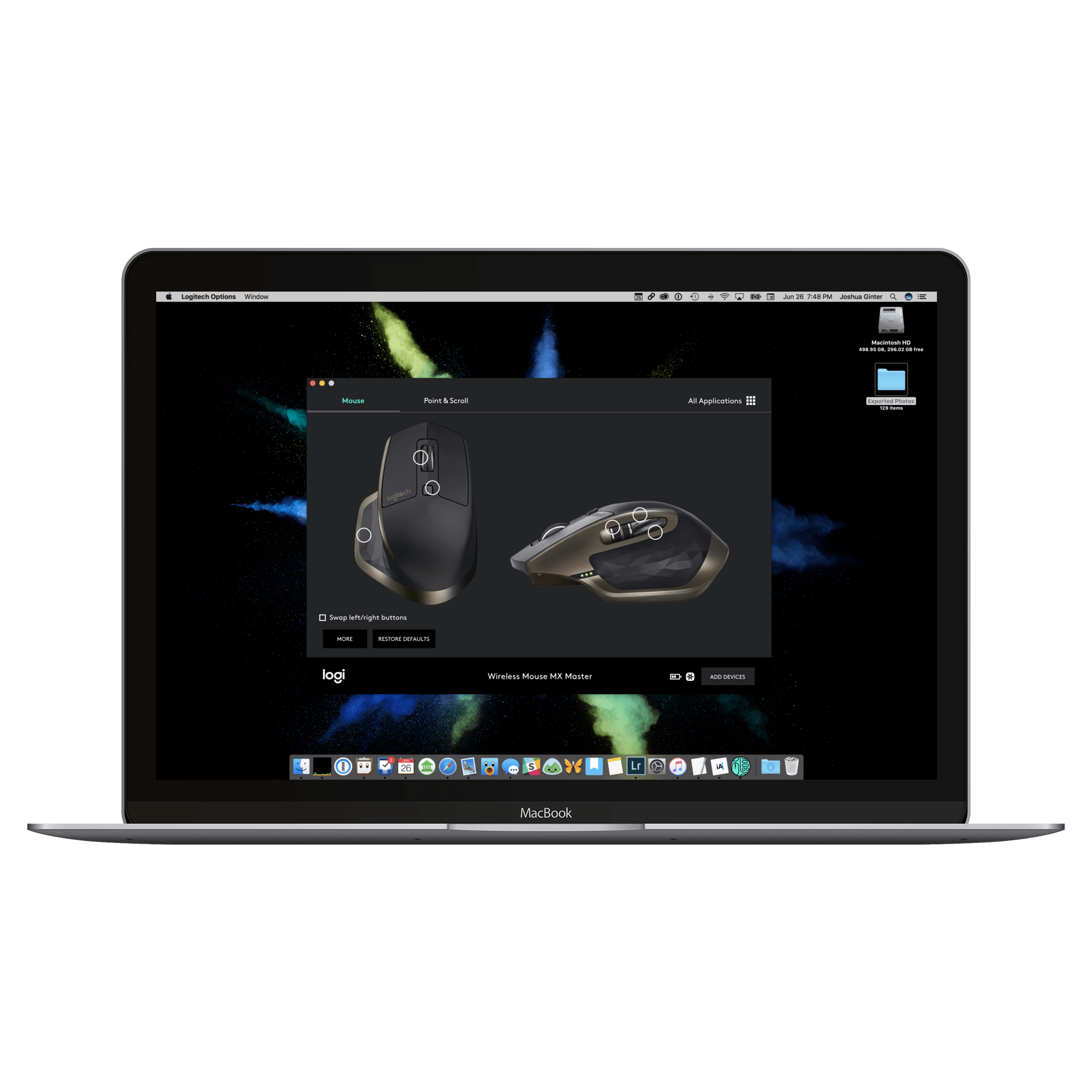
All of the MX Master's customization options are found within Logitech Options. Here, you can customize per app controls and gestures and other, system-wide options.
For instance, I have the horizontal scroll wheel set to flip between open tabs inside Safari or Chrome, while horizontal scrolling moves the worksheet left and right in Microsoft Excel.
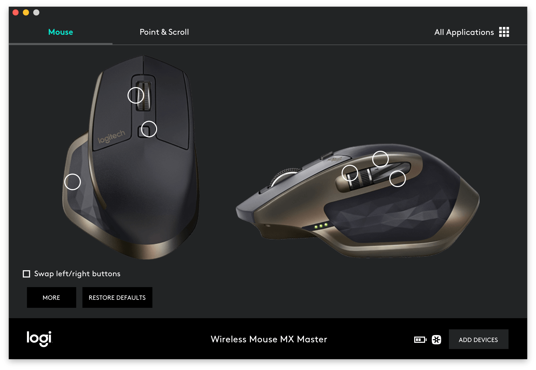
Each button is customizable, either system-wide or on an app-by-app basis.
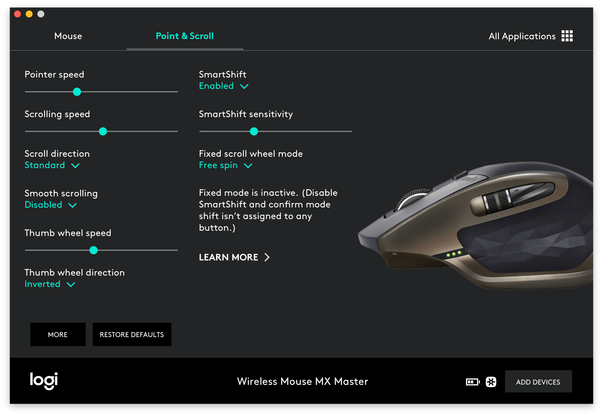
A look at all the Point & Scroll options.
When customization happens at an app level, the options are nearly endless.
Battery Life
Some companies take a liberal approach to battery life estimates and some take a conservative approach. Logitech’s battery life estimates for the MX Master are nothing short of ultra-liberal.
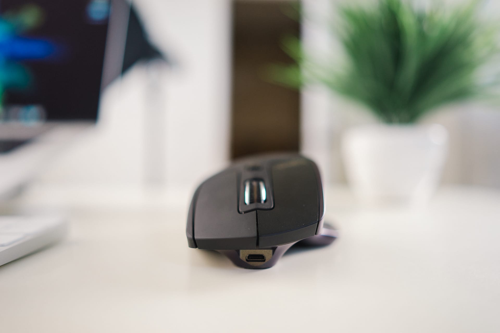
The MX Master is charged via the included micro USB cable. Fortunately, and unlike Apple's Magic Mouse, the port is located on the front of the MX Master, ensuring you can use the mouse while it's charging.
Which isn’t a problem really, when you break it down. The MX Master can charge up to 6 hours of usage in just 4 short minutes. If the small LED indicators tell you it’s time to charge, it’s not that difficult to plug in the mouse via its included micro-USB cable. Plus, the micro-USB charging port on the MX Master is situated in the front of the device, meaning you can use the mouse while it’s charging.
The ultra-liberal battery estimates come in the form of Logitech’s “40 days of battery life” estimates. On Logitech’s site, the cleverly located asterisk next to the “40 days of battery life” gets the company off the hook, stating certain computer conditions and 6 hours of daily usage were assumed when making the estimate.
But I get maybe 20 to 25 days on a single charge. And that’s pushing it. I’m not disappointed with this battery life — I keep the charging cord at the office and simply plug in when the mouse tells me to — but I don’t think it’s fair to expect 40 days of wireless usage out of the MX Master’s internal battery.
The MX Master 2S
Rounding back to the very-recently announced MX Master 2S, I’m grateful Logitech didn’t fool around with a winning design. The MX Master has very little wrong with it, and the MX Master 2S is proof Logitech understands what MX users are looking for.
- The MX Master 2S’s design is nearly unchanged, save for a few small shape changes and a few new colors.
- The MX Master 2S’s Darkfield tracking technology has been improved to a 4,000 DPI rating, meaning any minute movement of the mouse can be tracked more precisely.
- The MX Master 2S’s battery life has been improved to 70 days and can be recharged to 6 hours of usage in 3 minutes instead of 4 minutes.
- The MX Master 2S ships with Logitech Flow, a software allowing you to control multiple devices without having to switch connections. If Logitech Options is running on both computers, you can move your pointer between screens as though you were working on one machine.
From my chair, Logitech Flow is the biggest selling feature of the new MX Master 2S, followed by improved battery life and the 4,000 DPI precision for digital creators. However, these improvements may have no impact on certain potential buyers.
So while the original MX Master comes in at $60 on Amazon, the MX Master 2S’s $100 price tag may not be justifiable if the improvements have no impact on your computing workflow. For me personally, the original $60 MX Master more than meets any requirements I’m looking for, and I’d happily save the extra $40 for a sleek mouse pad — even if I don’t theoretically need one.
Conclusion
The Logitech MX Master is, after all, a computer mouse. At its core, it moves your pointer around your screen. It doesn’t take a $60 (or $100) device to get the job done.
But the MX Master continues the MX trend of going beyond the pointer. The MX Master’s ergonomic shape is important, especially as more employment shifts to pixel-pushing and number-crunching. Hyper scrolling and horizontal scrolling are increasingly important as well, as long screens of code get longer or your Excel budget worksheet gets wider. And what kind of world would we live in if Logitech charged $60 for a mouse that had to be connected via an actual cable?

There's a reason [the Logitech MX Master](https://www.amazon.com/Logitech-Master-Wireless-Mouse-Computer/dp/B00TZR3WRM/ref=sr_1_1?sr=8-1&ie=UTF8&keywords=logitech%25252Bmx%25252Bmaster%25252Bmouse&tag=toolstoystreview-20&qid=1498525704) is one of Amazon's best-selling devices today. I'm glad to see Logitech didn't change too much with [the latest MX Master 2S](https://www.amazon.com/Logitech-Wireless-Cross-Computer-Control-Sharing/dp/B071YZJ1G1/ref=sr_1_2?sr=8-2&qid=1498525704&keywords=logitech%252Bmx%252Bmaster%252Bmouse&tag=toolstoystreview-20&ie=UTF8).
The MX Master may look like a space ship and it could be initially off-putting for some less experienced computer users with all its customization options, but it won’t be long before those less experienced computer users find their new mouse to be indispensable.